
by Giovanni DiFeterici | Aug 21, 2013 | Gallery
Mezzolab is a nice modern portfolio site with attractive ice cream colors. Many of the interactions are fairly standard: rollovers with detailed information on the portfolio links, static nav, scaling logo, etc., but the complete package is impressive. The design...

by Maria | Aug 19, 2013 | Education, Gallery
The new VCU site (specifically the home page) is chock full of info that’s nicely organized and presented. Despite all that’s going on here, I feel like they struck a good balance between practical and promotional elements. Even more impressive is the...
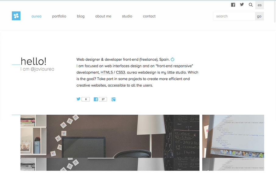
by Giovanni DiFeterici | Aug 19, 2013 | Gallery
Aurea is simple, clean and highly readable. I really enjoy the minimal palette and open layout. It’s a tight design with lots of contemporary details and a well designed aesthetic. Very nice. Cute dog too.
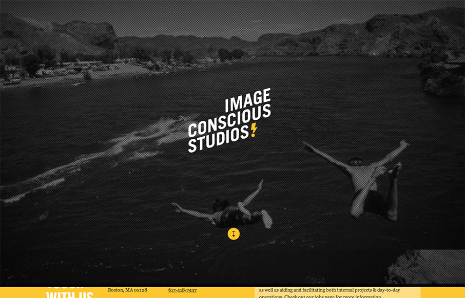
by Giovanni DiFeterici | Aug 15, 2013 | Gallery
This site is a beautiful mix of energetic, graphic type and low fidelity imagery. The effect is a highly dynamic scrolling experience with small blocks of content flowing by in counterpoint to large dramatic imagery. I enjoy the sense of humor and technical savvy. The...
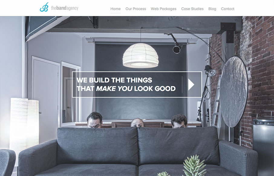
by Giovanni DiFeterici | Aug 15, 2013 | Design Firm, Gallery
I don’t know these guys, but I already love them. This site is funny as hell, but serious. I take them seriously. Seriously…. But seriously, the design has more character and fun that you can shake a stick at. And it looks good at all sizes. And it’s...