by Gene Crawford | Oct 6, 2014 | Food and Beverage, Gallery
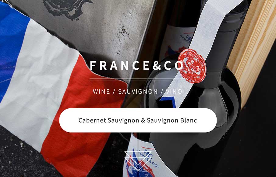
Looks like a simple site – but some nice background image, slight parallax feel in the scroll. A little confused on the copy translation and repeats, and the social icons that go nowhere. But the design itself is vibrant, and seems to get the brand’s image...