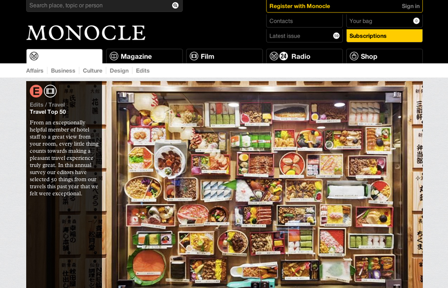
by Gene Crawford | Jan 3, 2013 | Gallery
The new Monocle design is smart and sleekly crisp. I really love the header interaction design. It goes from full height to small and sticky very fluidly. Then the asymmetrical feel to the broken up grid of story blocks as you make your way scrolling down the home...

by Gene Crawford | Jan 2, 2013 | Environment, Gallery
Nice clean and strong call to action with the big blue “start tracking” button. I also dig how the header stays fixed and the slideshow is part of main content section – nice way to pack in more relevant stuff there.

by Gene Crawford | Dec 21, 2012 | Gallery
This design is very crisp and nicely worked out. What I like most is the discreet interactions between scrolling/navigating down the page. The black to red shift in the line & icons keeps you informed and engaged on a visceral level. I just found this design a...
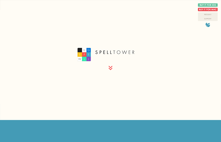
by Gene Crawford | Dec 18, 2012 | Gallery, Gaming
Superbly minimal design with the game’s narrative told mostly through illustrations and quick witted copy. It works pretty much the same in most screen width environments too. Bravo, the site makes me want to check it out with out even reading a single...
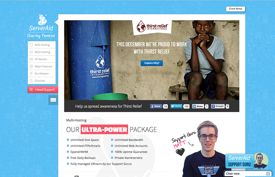
by Gene Crawford | Dec 11, 2012 | Gallery
Cool fixed nav on the left side of the site. I like the non-traditional feel of this layout. It makes it stand out pretty well. They’ve managed to pretty thoroughly explain what it is they do and also humanize who they are with the design as well. Smartly...