
by Gene Crawford | May 8, 2013 | Gallery
There’s a lot going on with this website design. There are so many different nav items and little things that you can click on, in a lot of ways it suffers the same issues that most big product websites do: too much stuff. They do a good job with keeping the...

by Gene Crawford | May 7, 2013 | Gallery
I like how the site is designed to be deceptively simple. It starts off with what looks like just a big head shot of Nathaniel but then as you click around you notice it’s intricacies and how the side nav is design. Then you start to scroll and notice the load...
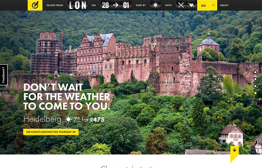
by Gene Crawford | Apr 18, 2013 | Gallery, Travel
I love the way the search is put together on this site. Human logic based or whatever you’d call that. Also the interactions are quite nicely done. The slight parallax on the main slideshow images is great and not overused and the photos are just brilliant. The...
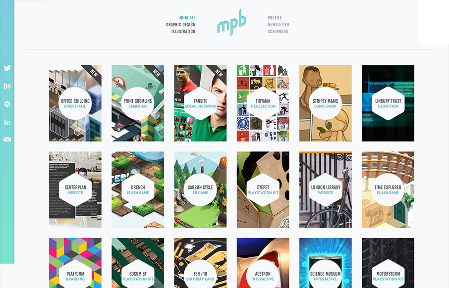
by Gene Crawford | Apr 16, 2013 | Gallery, Portfolio
Nice simple display of the artist’s work with a clean grid and minimal color palette. But it’s the little details, the RWD and the interactions on the title shapes that complete the design and make it feel so finished and polished. Great work here....

by Gene Crawford | Apr 9, 2013 | Gallery
I love the start graphic feel to this site and the minimal color palette is just great. The lead in animation with the logo and slide up to the fixed navigation give this site a nice vibe of technical sophistication. I also like the clearly differentiated sections of...