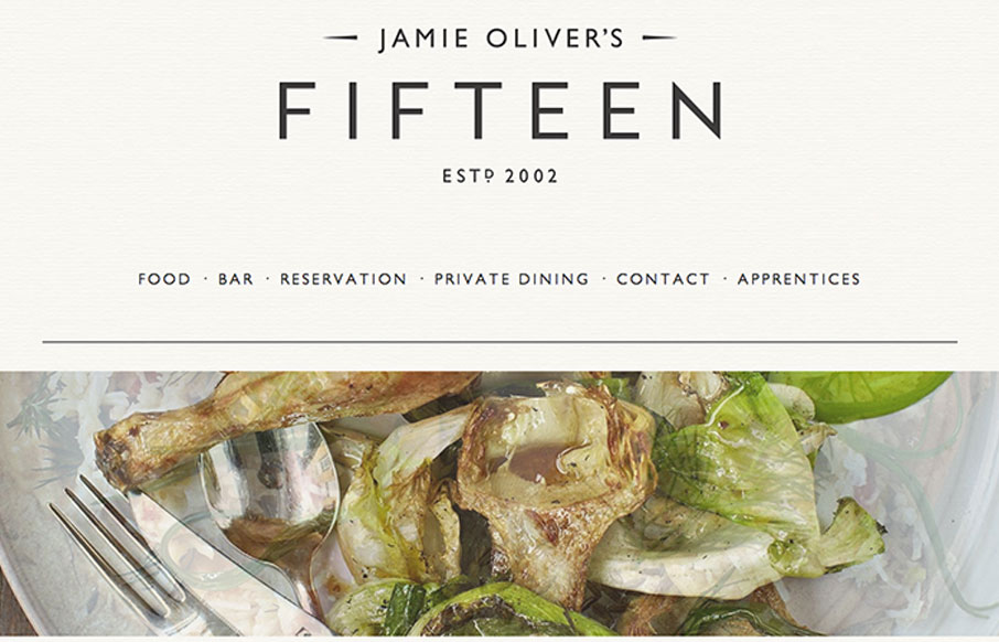
by Maria | Aug 26, 2013 | Food and Beverage, Gallery
Just another polished, parallax site with beautiful imagery and svelte typography. Ho hum. 🙂 Doesn’t mean we can’t call it out for being nice, right? Either way, it’s got a nice feel and I appreciate subtle details like the rotating images and the...
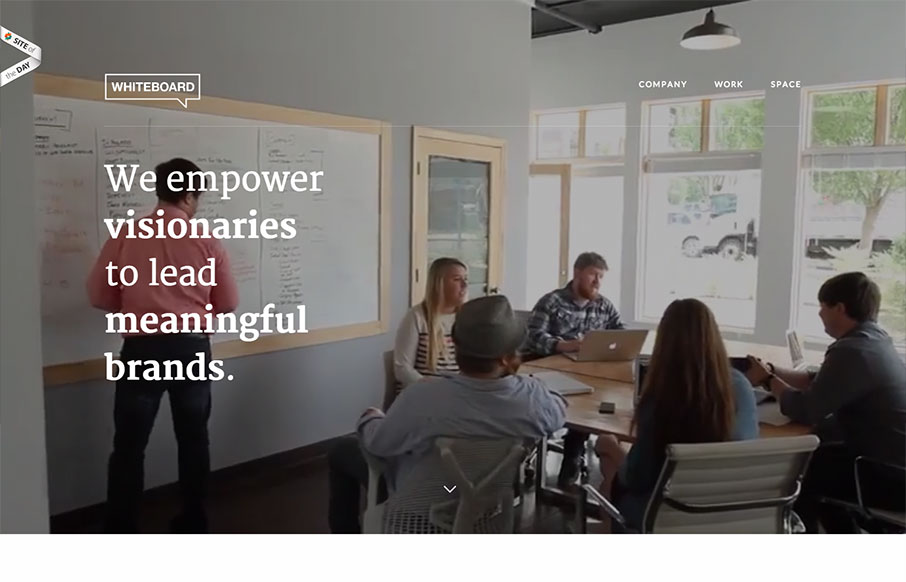
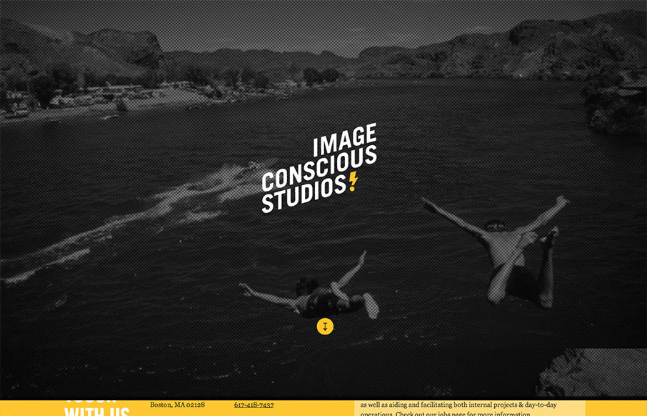
by Gene Crawford | Aug 21, 2013 | Design Firm, Gallery
Man this site is mind blowing. It’s really simple in it’s layout and visual framework but it’s just so chock full of cool stuff to look at. I really love the scrolling videos in the background they help tell the story so quickly without really...
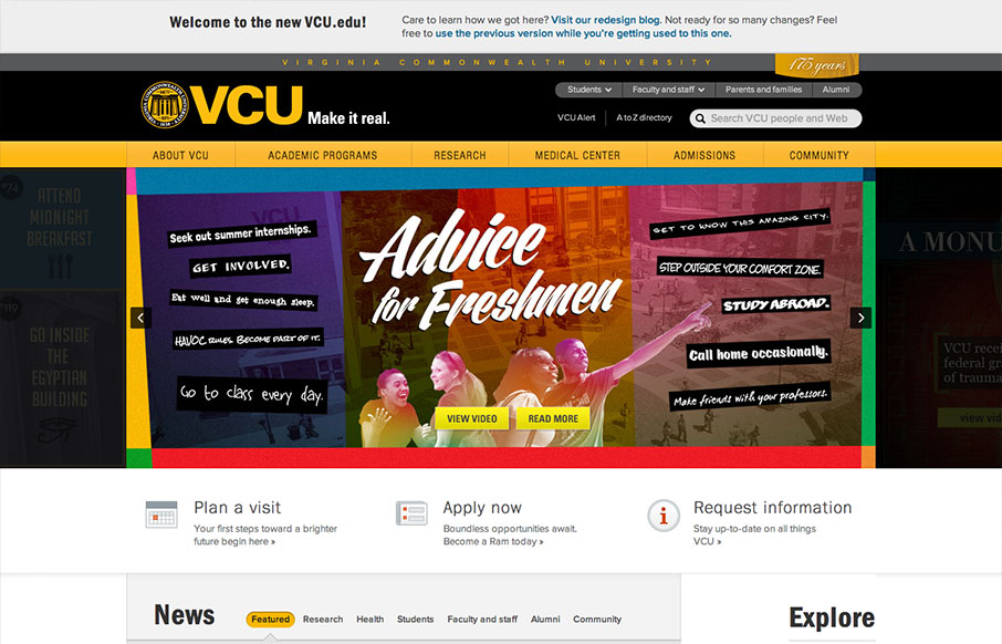
by Maria | Aug 19, 2013 | Education, Gallery
The new VCU site (specifically the home page) is chock full of info that’s nicely organized and presented. Despite all that’s going on here, I feel like they struck a good balance between practical and promotional elements. Even more impressive is the...
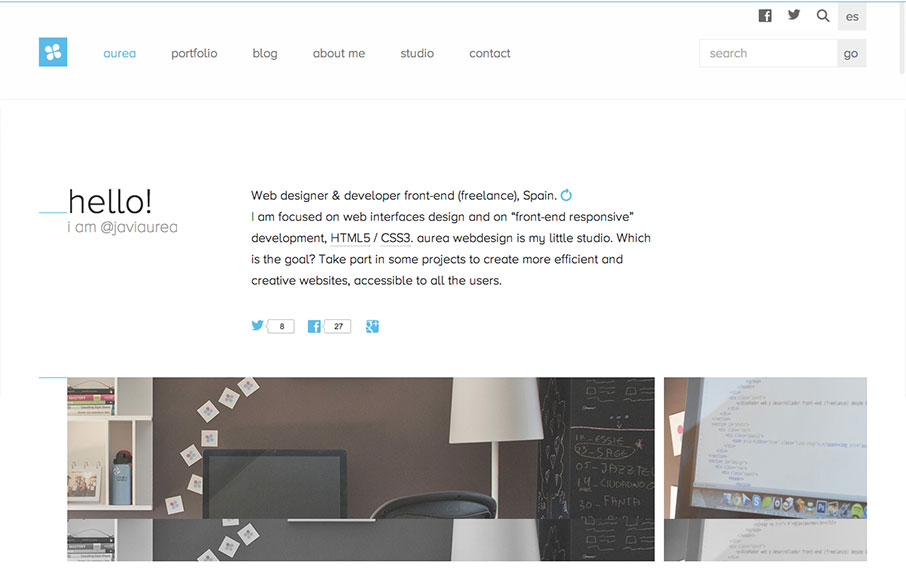
by Giovanni DiFeterici | Aug 19, 2013 | Gallery
Aurea is simple, clean and highly readable. I really enjoy the minimal palette and open layout. It’s a tight design with lots of contemporary details and a well designed aesthetic. Very nice. Cute dog too.
by Giovanni DiFeterici | Aug 15, 2013 | Gallery
This site is a beautiful mix of energetic, graphic type and low fidelity imagery. The effect is a highly dynamic scrolling experience with small blocks of content flowing by in counterpoint to large dramatic imagery. I enjoy the sense of humor and technical savvy. The...