
by Aaron Griswold | Jun 26, 2014 | Gallery, Nonprofit
A good use of white (blue) space, in order to highlight what matters (on the site, and in life). I like the liquid background, that continues to enforce the theme of providing clean water for children. The “See how people are taking action to help children...
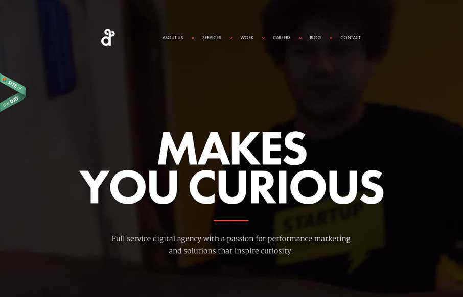
by Gene Crawford | Jun 25, 2014 | Gallery
Clean design and some subtle movement here and there. I like the little animations and fade ins the page has as you scroll or shift browser width around, it’s subtle but has big impact when you’re experiencing it.
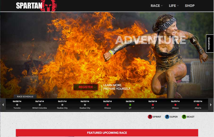
by Aaron Griswold | Jun 24, 2014 | Gallery, Sports/Recreation
So the Unmatched Style Wrecking Crew just signed up for our second Spartan Race yesterday. We signed up for The Beast – which is the toughest race we’ve done yet: 12+ miles, 25+ obstacles – most of them involving mud. We have 17 weeks 3 days and 10...
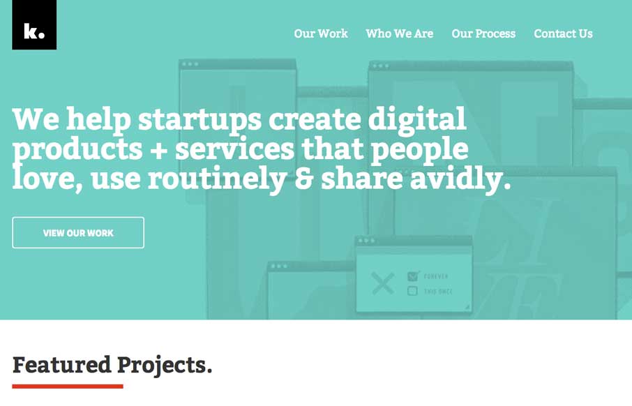
by Gene Crawford | Jun 23, 2014 | Gallery
I love this site design. It uses some familiar design patterns but I especially like the interactive stuff on the main header/nav. The animated movement is quite nice and the rest of the site as you scroll is great to take in visually. Good stuff. Submitted by: Hrvoje...

by Gene Crawford | Jun 20, 2014 | Gallery
Lots of good design queues in this site. Narrative and good visuals to support it. When that’s done well that’s all you need folks. 🙂 Submitted by: Ben De Rienzo @derienzo777 Role: Designer