
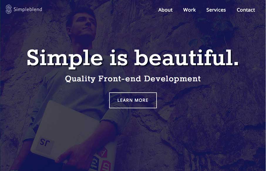
by Gene Crawford | Oct 29, 2014 | Gallery
Wonderfully simple but elegant layout. Tight spacing between elements and good vertical rhythm really makes this site feel like it was crafted with love. Also – check out the map on the contact page – same Google map – different look though.

by Gene Crawford | Oct 28, 2014 | Gallery
Very intriguing layout. I like the main hero image area and the way pieces scroll into view. The map and contact form have a nice designery touch too.
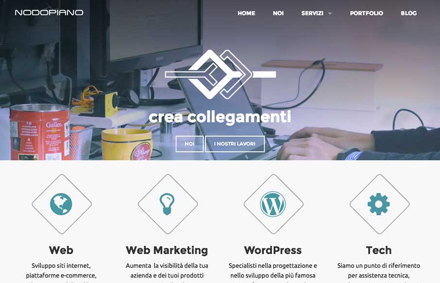
by Gene Crawford | Oct 27, 2014 | Gallery
It’s always nice when there’s a strong base to a design and always awesome when you layer good detail work on top of that strong base. That’s what the Nodopiano site design does so well. This is my last work,the website for an italian web agency....

by Gene Crawford | Oct 24, 2014 | Gallery, Marketing Company
Great look to this site. I dig the transitions from desktop to mobile on the responsive approach here. Also generally speaking the design utilizes some blocks or chunks of content which works well for scanning and adapting to different screen widths.
by Gene Crawford | Oct 23, 2014 | Gallery
Pretty much standard fare when it comes to design patterns of a portfolio site. However, the soft feel of the colors and design work and some details in the interactions, like the work samples section make this site work well enough for me to keep digging into the...