by Aaron Griswold | Feb 25, 2015 | Gallery, Portfolio
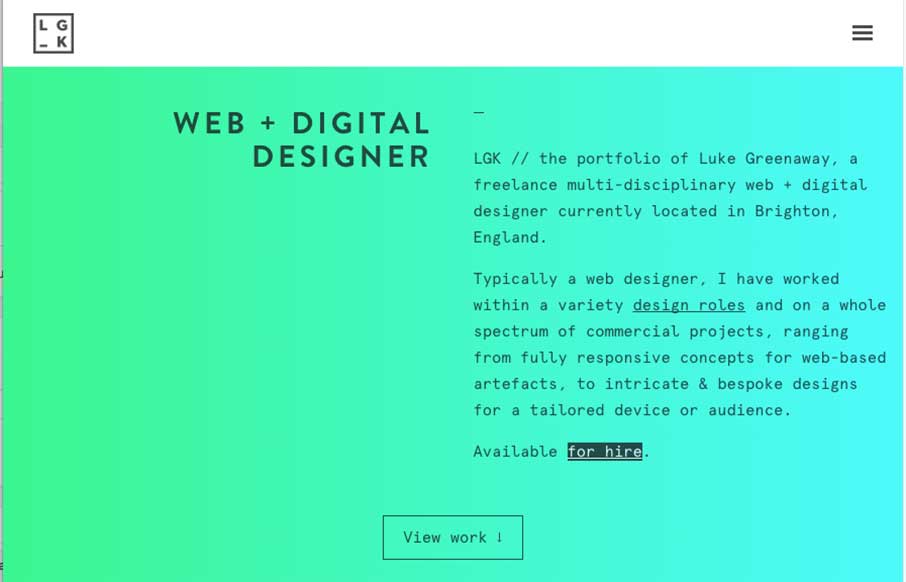
Really like this portfolio site from Luke Greenway out of Brighton, UK. It’s smooth and classy? – can’t find better words for to describe that right now. Also starting to like this trend of sticky headers that reveal in a different color when you...
by Aaron Griswold | Feb 25, 2015 | Gallery
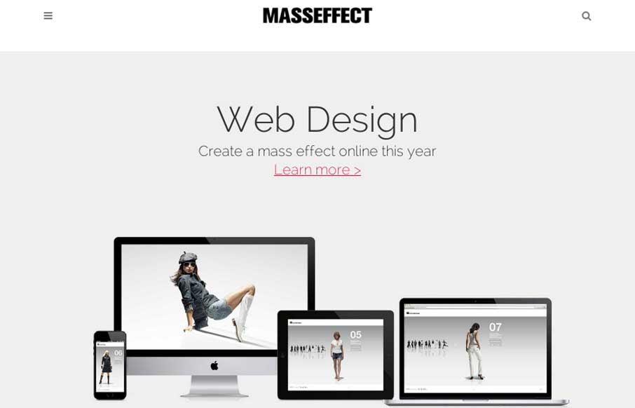
Good clean agency site out of Sydney from Mass Effect. There are some places that could use a little less SEOing (like the footer) – but I like when sites use neutral coloring like this as a backdrop – and let their work be the coloring – would like...
by Gene Crawford | Feb 24, 2015 | Design Firm, Gallery
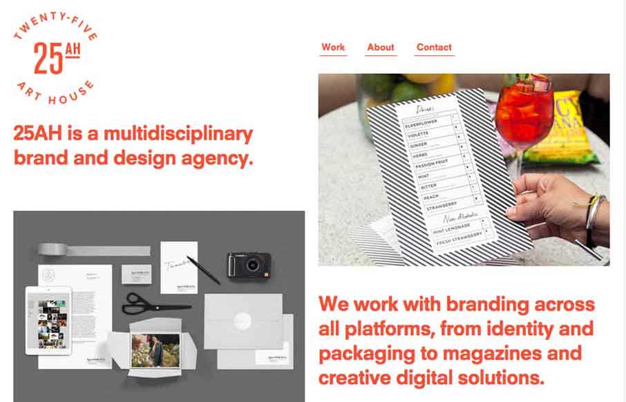
The 25 Art House website has a really cool vibe with the clean and crisp typography and the large notecard looking case study link blocks. I dig the ‘masonry’ loading and sliding around the link blocks do as well on screen resize. Cool site.
by Gene Crawford | Feb 23, 2015 | Gallery
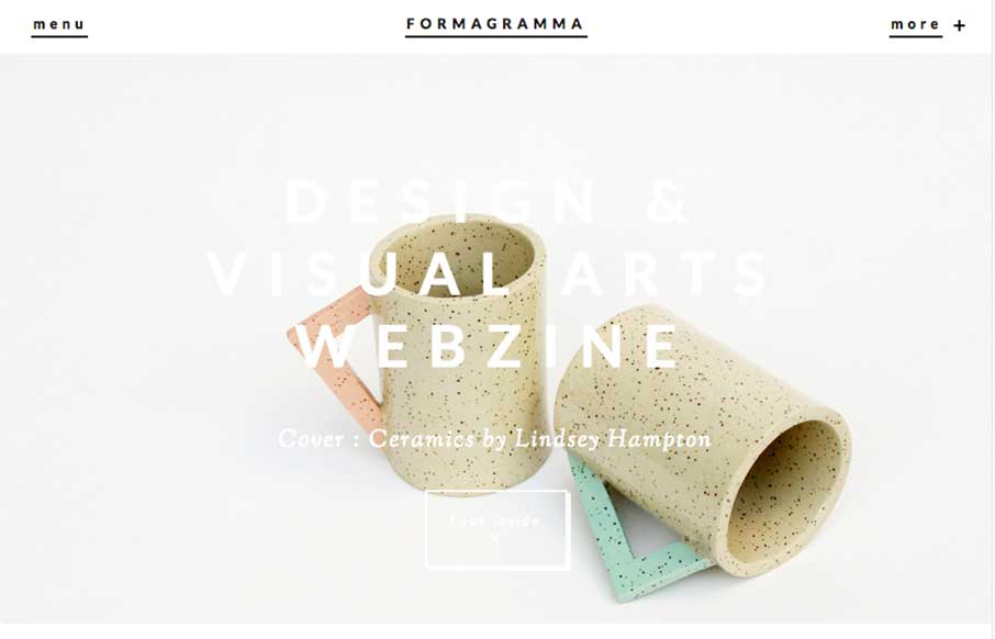
Really interesting visual approach. It has the ‘feel’ of an art or design magazine for sure. I really like the ‘view article’ overlay for the sections as you make your way past the hero area. I also like the way they’ve handled the main...
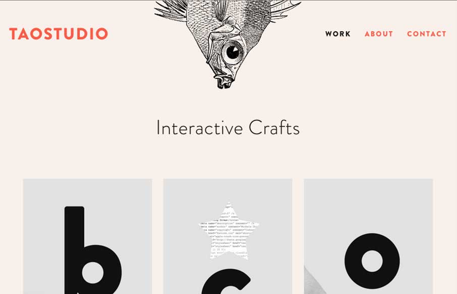
by Gene Crawford | Feb 23, 2015 | Gallery
I really enjoyed looking through this website. BTW the fish blinks… The design is beautiful and I love the contrast with the light line work in the design with the heavy typeface.