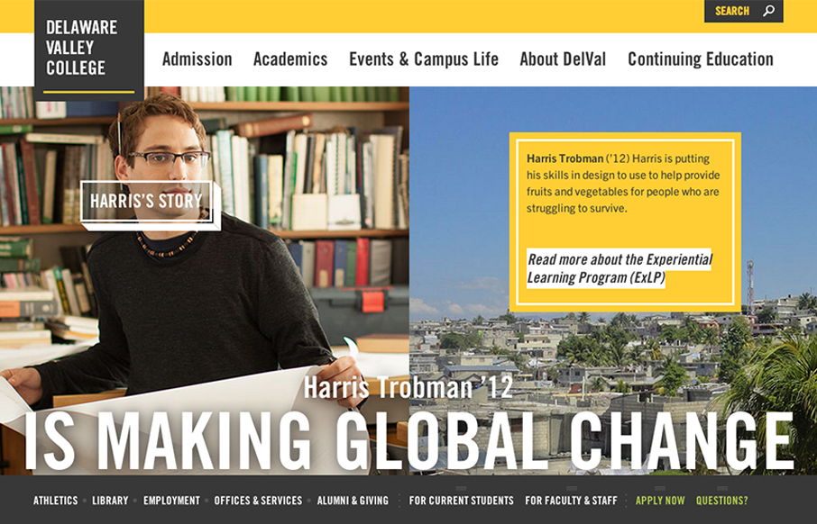
by Gene Crawford | Jan 7, 2013 | Education, Gallery
The @happycog-designed responsive redesign of delval.edu is seriously stunning. Love. /via @zeldman— Responsive Design (@RWD) December 19, 2012 I love the visual style of this site. It’s blocky and squared off and generally feels very graphic. I dig the...
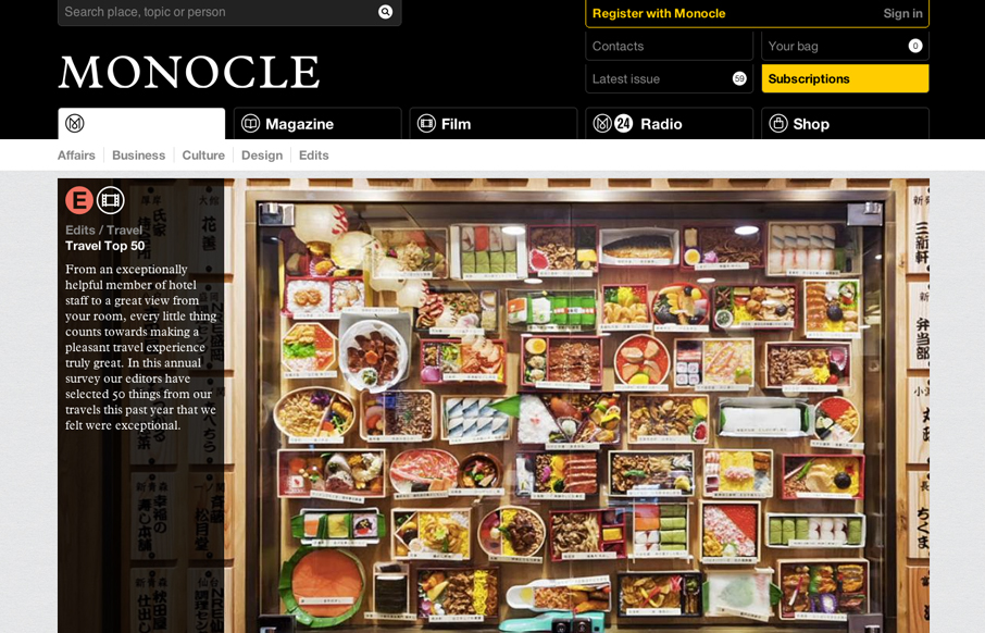
by Gene Crawford | Jan 3, 2013 | Gallery
The new Monocle design is smart and sleekly crisp. I really love the header interaction design. It goes from full height to small and sticky very fluidly. Then the asymmetrical feel to the broken up grid of story blocks as you make your way scrolling down the home...
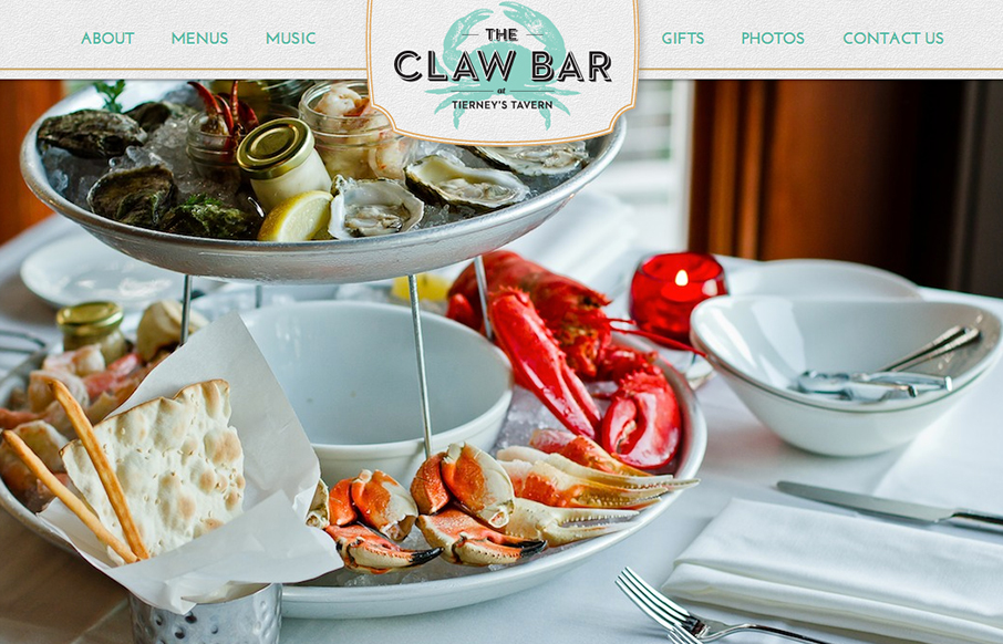
by Gene Crawford | Oct 2, 2012 | Food and Beverage, Gallery
Nice touch with the fixed header and footer, it makes the site really feel like a menu. Wonderful example of a restaurant website, if only it were responsive it’d be perfect IMHO. But it’s pretty damn close now…
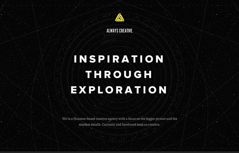
by Giovanni DiFeterici | Sep 10, 2012 | Design Firm, Gallery, Screencast Review
This site is beautifully wide open, with subtle animations and a complex mix of textures. It is somewhat narrative through a combination copy about exploration and imagery of space. Their vision is simply stated, which I like, and the design is super-clean (which I...
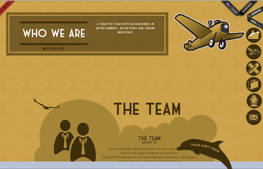
by Gene Crawford | Jul 12, 2012 | Gallery
Submitted by: Tineke Timmerman @inTOWN_NL Role: Designer & Developer Pretty cool interaction on the footer. The “please do not touch” dolphin got me. I touched it… Overall I really like the type and the illustration fo the boat. It’s like...