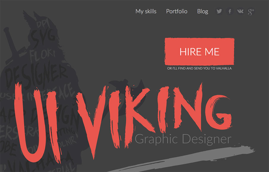
by Gene Crawford | Jan 7, 2016 | Gallery, Portfolio
This. Site. From top to bottom I love. It’s a great exercise in branding and keeping your message through every single detail. It’s also super well done and beautiful. Also, I like Vikings. Seriously, go spend time on the site and enjoy the details. From...
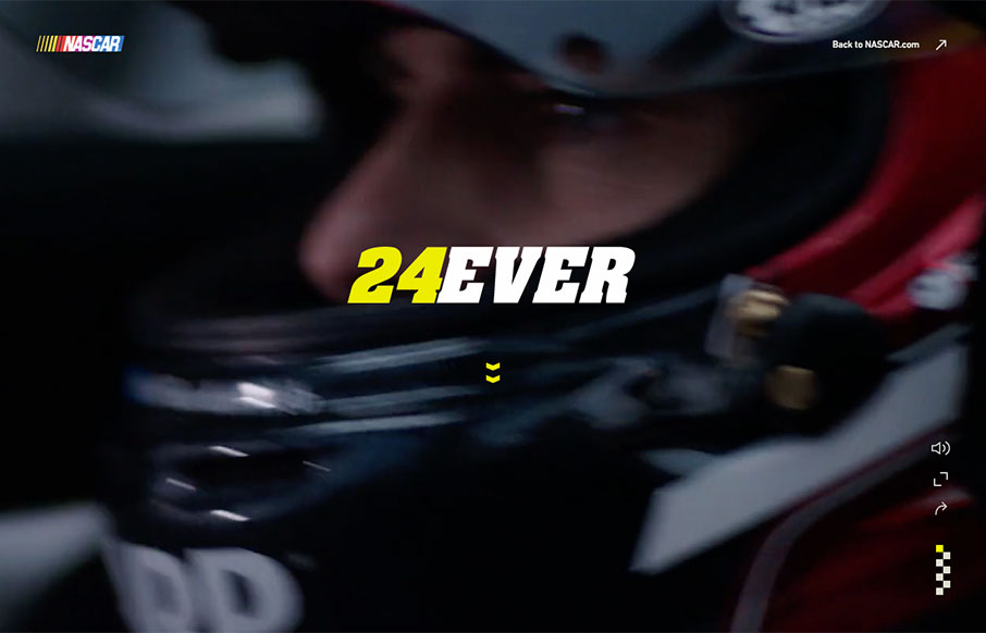
by Aaron Griswold | Jan 6, 2016 | Gallery, Sports/Recreation
I have to admit that when Jeff Gordon came into the sport of NASCAR, I wasn’t a big fan (I was an Earnhardt fan) – but I’ve grown to like Wonder Boy and the Rainbow Warriors over the years. This tribute site to his 24+ year career is pretty sweet...
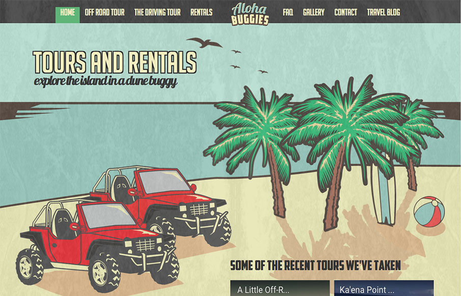
by Aaron Griswold | Jan 5, 2016 | Gallery, Travel
This is a fun site from Aloha Buggies in Hawaii – great artwork throughout. I wish the mobile version was the same as the desktop – but I’m glad there is a mobile version. Working with a travel company for their site, we know organizing all of this...
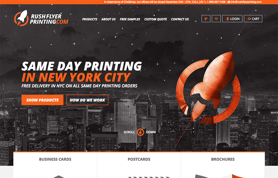
by Aaron Griswold | Dec 28, 2015 | Gallery
We’ve done some work for some printing companies (both 2 and 3d) in the past year, and know how hard it can be to merge the design side of a client facing website, with the functionality of an ordering web app. This site from Rush Flyer Printing out of NYC, is a...
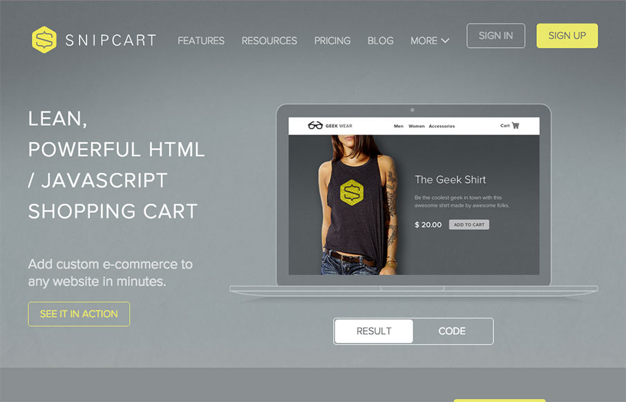
by Aaron Griswold | Dec 21, 2015 | Gallery, Shopping
Decent site from Snipcart out of Quebec – one thing I like is the mega-dropdown in the nav – keeps the site cleaner. Also like the line illustrations on each page (and in the nav) – cool. From the Designer: Complete marketing website for Snipcart, a...