
by Gene Crawford | Feb 4, 2016 | Gallery, Marketing
Overall good design and some strong graphics make up this website. Some pretty cool load in animations as you make your way down the page. I like the way the main nav situates itself as you scroll past the hero area/image too.
by Aaron Griswold | Feb 2, 2016 | Gallery
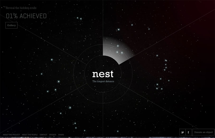
It’s very rare that we look at a Flash site, because for some reason people decided that Flash sites don’t work / aren’t cool / won’t work on your iPhone / whatever. We feel there is still a place for sites like this, especially when...

by Aaron Griswold | Feb 1, 2016 | Gallery, Portfolio
Portfolio of Isaias Mulatinho out of Brazil – I like the red and white on the black – and the cool logo. From the Designer: This is a release of my works during the last years, branding, designing and marketing. Thank you for appreciating. Submitted by:...
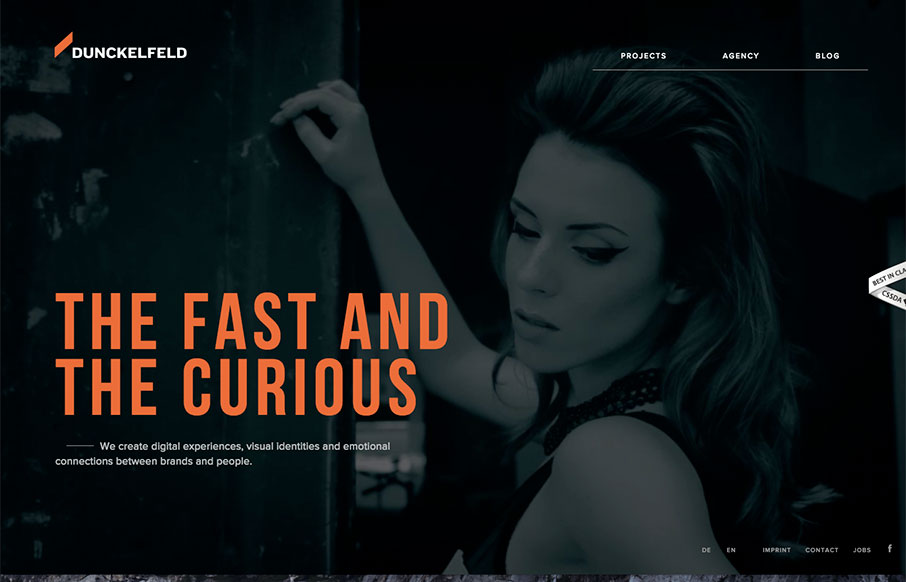
by Gene Crawford | Feb 1, 2016 | Gallery, Marketing Company
There is some rather interesting interaction/animation on this site. I like the way the elements load up the first time you visit. It can be a bit slow to react to you as you make your way through it, which I could see may lead to some confusion on the user’s...

by Gene Crawford | Jan 28, 2016 | Gallery
Pretty slick looking layout for Studio Rodrigo. I really like the big open areas matched up with smaller product images in a small grid like it has. Pretty solid design as you scroll down the home page too. Love this site.