by Gene Crawford | May 10, 2016 | Gallery
This site has a lot of really cool looking sections. It’s mainly a product site first and foremost and it really does a good job selling the product both visually and contextually and at the same time it really sells the quality of the product with it’s...

by Gene Crawford | May 9, 2016 | Gallery
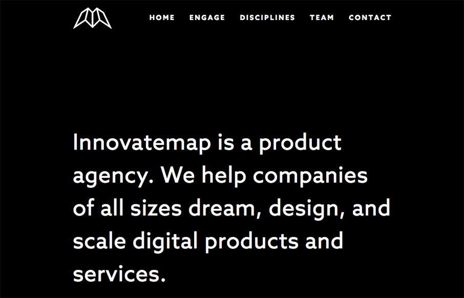
Man what a cool website. I love when things can be simply and easily communicated without much fuss (interaction/animation/crazy) and this site does just that. With visual pacing, clever graphic design and layout the Innovatemap site just drives along where it needs...

by Gene Crawford | May 5, 2016 | Gallery, Portfolio
Pretty clever visuals, simple execution, means I like it. Particularly the Bushido section… Hell that could be the home page really. Love this stuff. Submitted by: Steve Fraschini Twitter: @Novagraphix Role: Designer Country:...

by Gene Crawford | May 5, 2016 | Gallery, Portfolio
Very, very fun website. From the skull to the interactions and page transitions this site is gold. Spend some time on it and you’ll see what I mean. Some great work in the portfolio too.

by Gene Crawford | May 3, 2016 | Gallery, Portfolio
I love this design. The colors feel very “new” to me, like i’ve not seen it yet. The layout is pretty straight forward but really boosted by the imagery and type. I freaking love the interactions on the buttons. So good.
