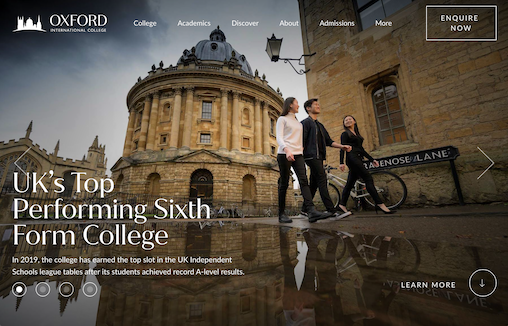
by Gene Crawford | Oct 6, 2023 | Education, Gallery
Oxford International College is an independent sixth form college offering A-Levels, GCSEs, and a range of short courses.
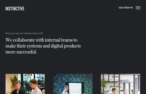
by Gene Crawford | Oct 4, 2023 | Design Firm, Gallery
Instinctive are app developers in London, and are part of the Plug & Play (UK) Group; a business that designs and develops mobile apps, web apps and delivers software development for funded start-ups and established app companies uk and globally.

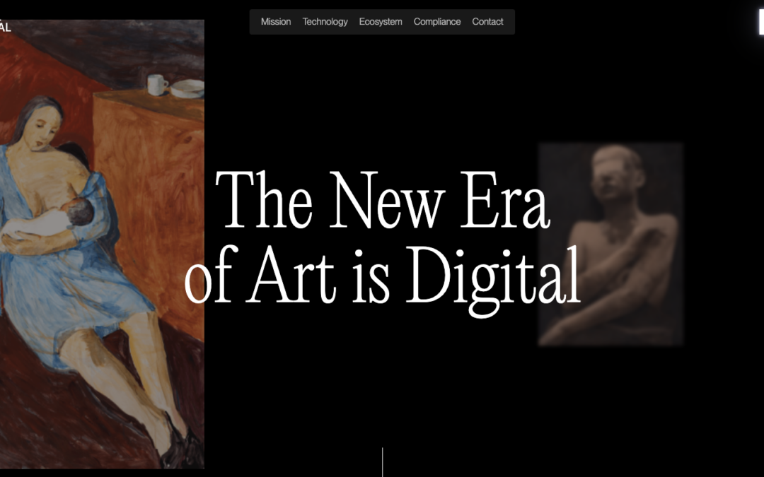
by Gene Crawford | Oct 2, 2023 | Design Firm, Gallery
Real nifty layout with fun details. I like the movement as I scroll and the overall vibe here. I really love that red, contact, section – the moment you see it as you scroll is solid.
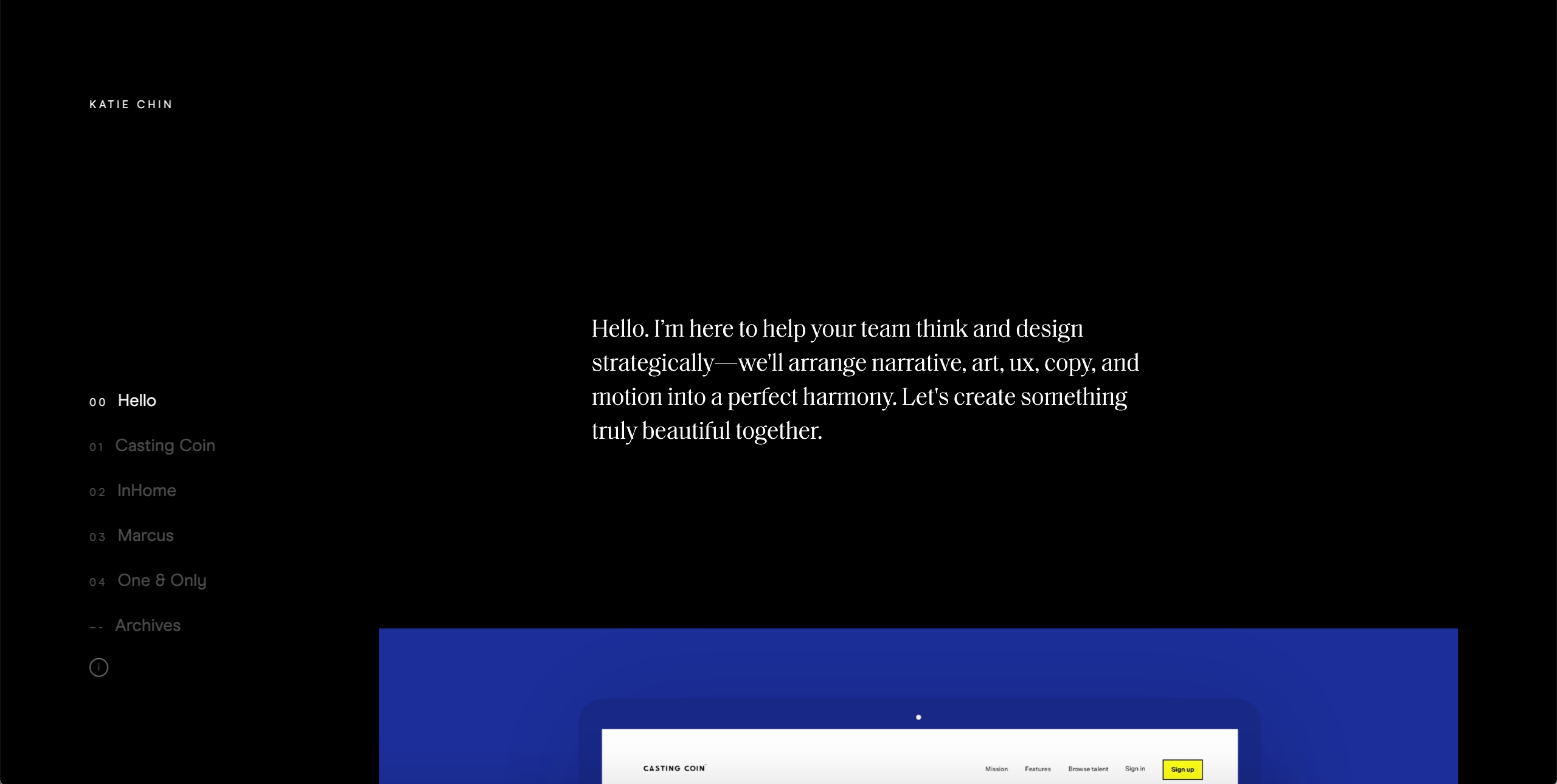
by Gene Crawford | Sep 29, 2023 | Gallery, Software
Overall this is a fun experience on the first viewing of the website. I really like the dark background and layout details. I feel like the dark background reinforces the brand so it really feels purposeful. I will say that on 3rd or 4th viewing it was tedious in that...
by Gene Crawford | Sep 15, 2023 | Gallery, Portfolio
This is a custom portfolio designed and built to make the viewing experience of work effortless and immersive. Each project scrolls right into the next for busy hiring managers who have limited bandwidth. The full-width photos and themed sections helps us focus on the...