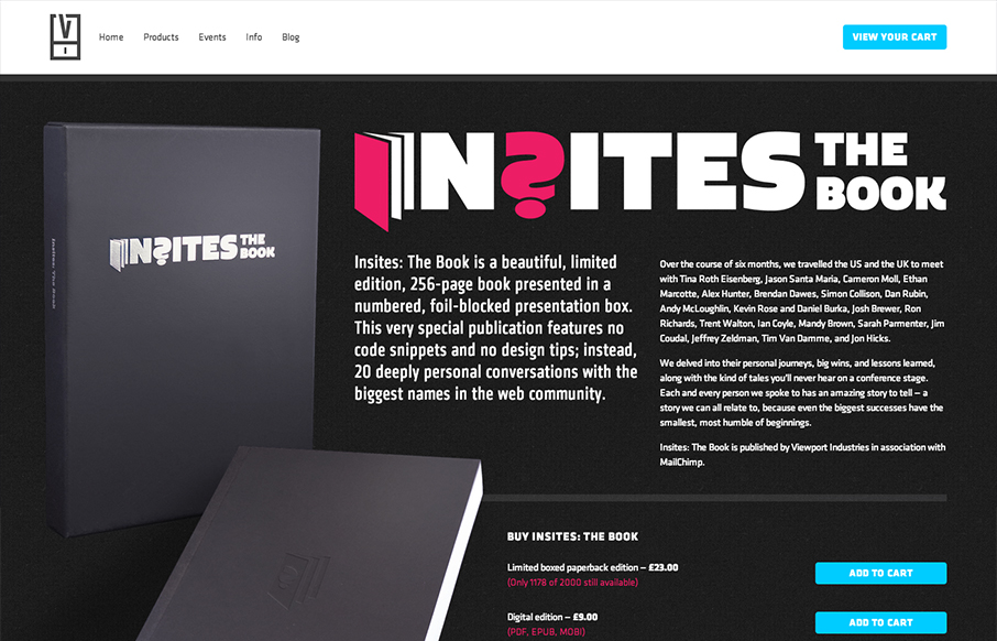
by Gene Crawford | Oct 4, 2012 | Gallery
The Insights book site is a well structured and bold design. I like most that they’ve designed it for super wide monitors and iPhone screens alike. Super nice design!
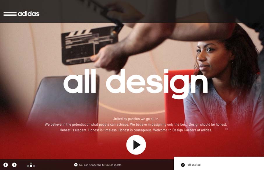
by Gene Crawford | Oct 1, 2012 | Gallery
Damn this is a sexy website for the Adidas design studios. I love the navigation design and it incorporates with the overall UX and look of the rest of the site. Overall the narrative driven design just gets me excited. I love the sections and the keyboard nav...
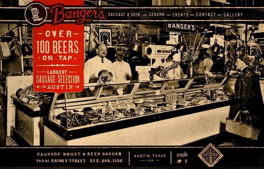
by Maria | Sep 27, 2012 | Food and Beverage, Gallery
Such a visually rich design. I love the distressed graphic feel to this and the red really makes it “pop” (that was sarcasm, did I just make some of you designer’s brains explode?). It looks like there’s a slight parallax with the background...
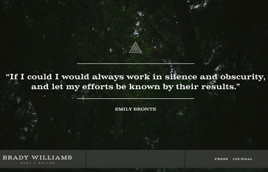
by Gene Crawford | Sep 26, 2012 | Food and Beverage, Gallery
“Brady Williams, a chef in Dallas, TX, shows his craftsmanship and passion for the culinary arts in this elegantly simple website. Personal sites tend to focus on the maker first, and the things created second. Not so here. Brady shows his passion, he...
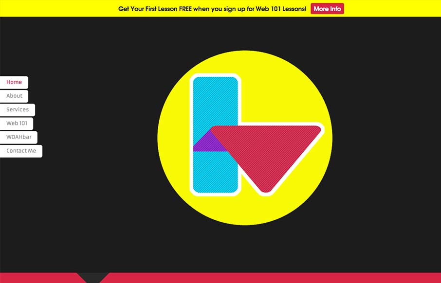
by Gene Crawford | Sep 25, 2012 | Gallery
Interesting single pager. Chock full of bright colors and solid looking illustrations/icons. I like the fixed nav on the left, it’s a nav design i’ve seen before but it just looks like it fits here better than others. There are some sections where the...