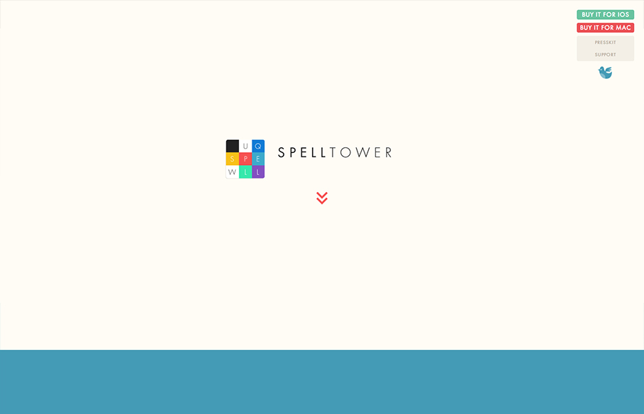
by Gene Crawford | Dec 18, 2012 | Gallery, Gaming
Superbly minimal design with the game’s narrative told mostly through illustrations and quick witted copy. It works pretty much the same in most screen width environments too. Bravo, the site makes me want to check it out with out even reading a single...
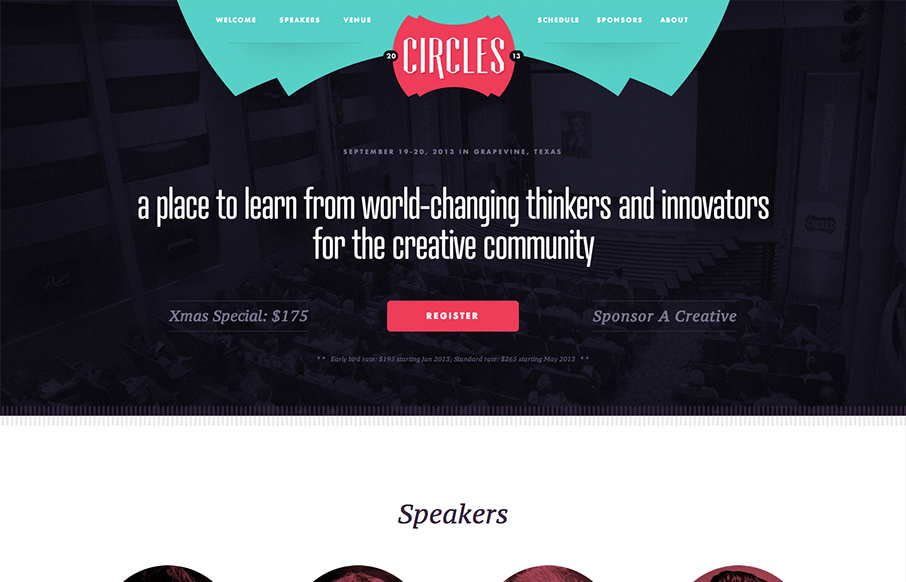
by Gene Crawford | Dec 17, 2012 | Gallery
Superb conference website. I love the clean glide of the design, it’s just easy to scroll down and scan. Without even reading a word you know what the deal is going to be. It also makes you feel welcome with the color tones and soft cornered elements. Love it....
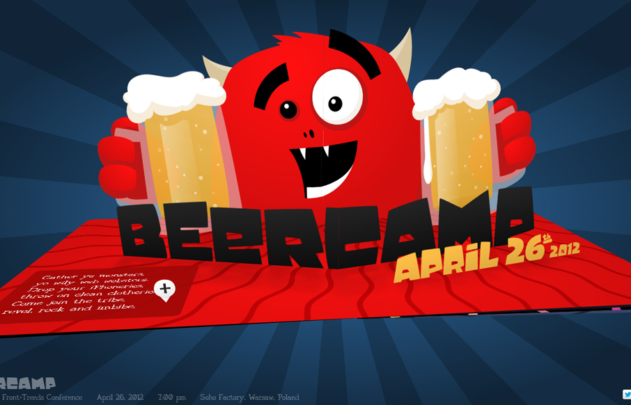
by Gene Crawford | Dec 12, 2012 | Gallery
I can’t believe we didn’t review the 2012 Beercamp site so far this year. This site will not escape the gallery here on UMS. It’s a friggin’ pop-up book for crying out loud. Just marvel at it’s awesomeness and enjoy. Also, Monsters!
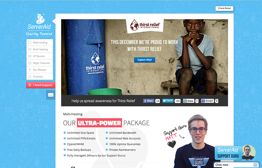
by Gene Crawford | Dec 11, 2012 | Gallery
Cool fixed nav on the left side of the site. I like the non-traditional feel of this layout. It makes it stand out pretty well. They’ve managed to pretty thoroughly explain what it is they do and also humanize who they are with the design as well. Smartly...

by Gene Crawford | Dec 10, 2012 | Food and Beverage, Gallery
Pretty nifty interactions and page load animation. Keeps the site very memorable visually.