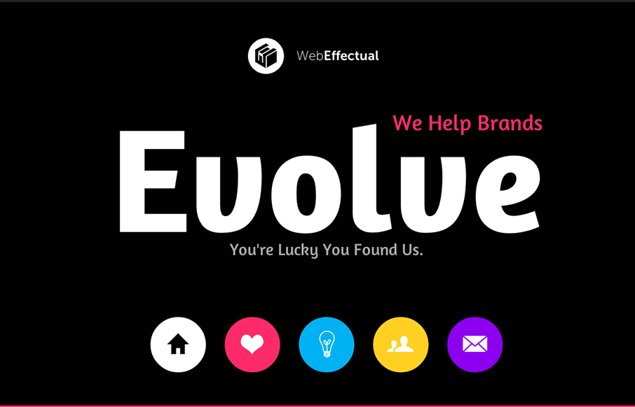
by Gene Crawford | Mar 1, 2013 | Gallery
Very nice smooth feeling design. I like the interstitials designed into this single page layout so much. THe smooth action of the slight parallax and the oversized navigation icons/buttons make this a pretty playful layout as well as highly interesting interaction...
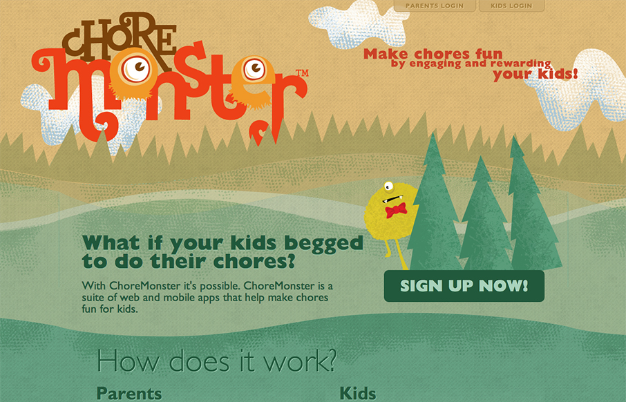
by Jay Barry | Mar 1, 2013 | Gallery
So kids hate chores and love monsters, so enter ChoreMonster. My first reaction to this was a snort and then wondering whatever happened to cash and/or spankings (I kid!). In my day… Anyway, aside from whether this product is a good idea or not, it really...

by Gene Crawford | Feb 28, 2013 | Entertainment, Gallery
This is an interesting single page site. I can’t tell if it’s just the gateway into the app or a coming soon style page, but it’s well done nonetheless. I especially love the email signup form, the way the submit button looks placed within the field...
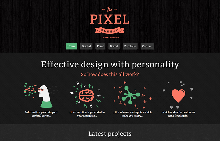
by Gene Crawford | Jan 22, 2013 | Gallery
Submitted by: Alex Berry @iluvrobots Role: Designer & Developer The Pixel Bureau site is a nice clean dark background site design. Nice illustration work to help pump it up and make it fun visually. I like the green and orange(ish) colors used here too. Good...
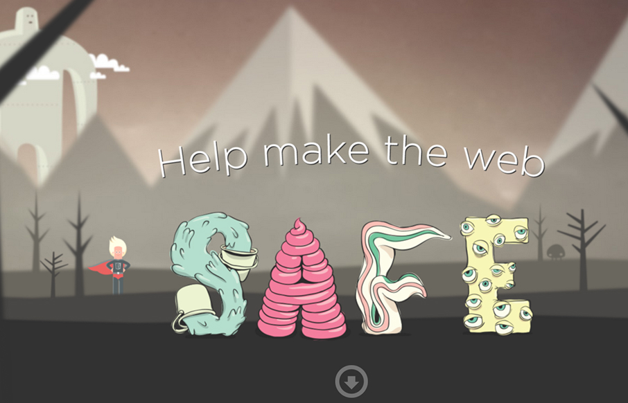
by Gene Crawford | Jan 22, 2013 | Gallery
Submitted by: Ryan Ryan Role: Designer & Developer Saving the Internet, one browser update at a time. Pretty fun design. I like the illustrations very much, they feel like the Adventure Time cartoon.