
by Gene Crawford | Apr 19, 2013 | Gallery
Yes, it’s not often we feature a ‘coming soon’ page here on UMS but this one is very well done. I love how they’ve taken the product and the RWD building process and just told the story of the app around that. Both visually and copy wise that...
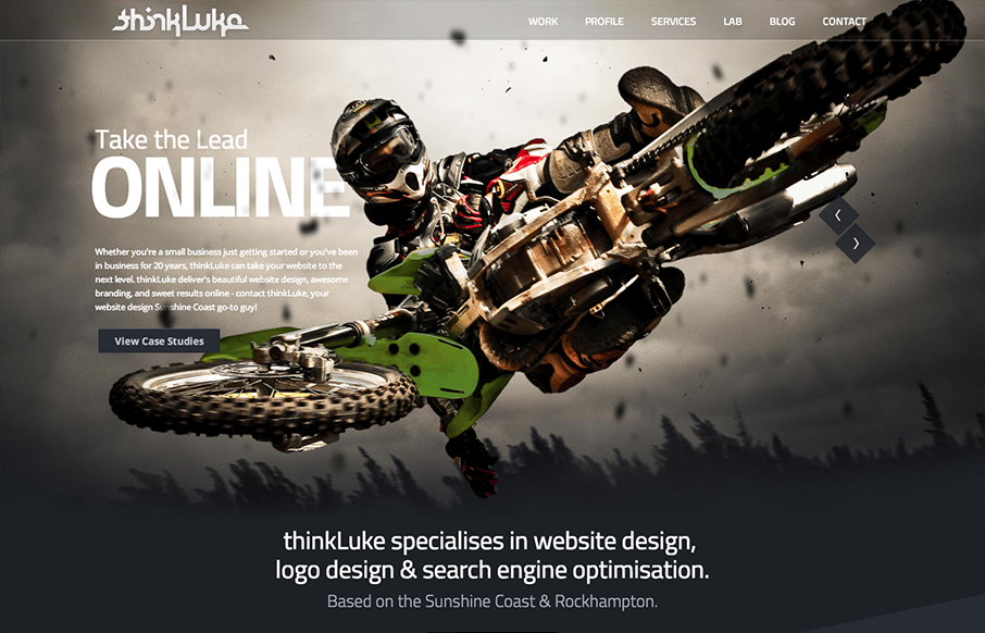
by Gene Crawford | Apr 16, 2013 | Design Firm, Gallery
I love the “mouse follow” animation, i’m not sure what to call that, worked into the main image and slide show on the home page. They’ve managed to make it look cool with the photography. I also like the diagonals and greens worked into the...
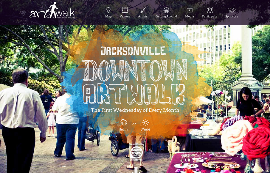
by Gene Crawford | Mar 18, 2013 | Gallery
This site perfectly sells the Jacksonville Art Walk. The colors are inviting the type if accessible to most people yet fresh feeling. It’s also responsive which is a great move since a lot of folks will hit this site while at the event or close trying to find...
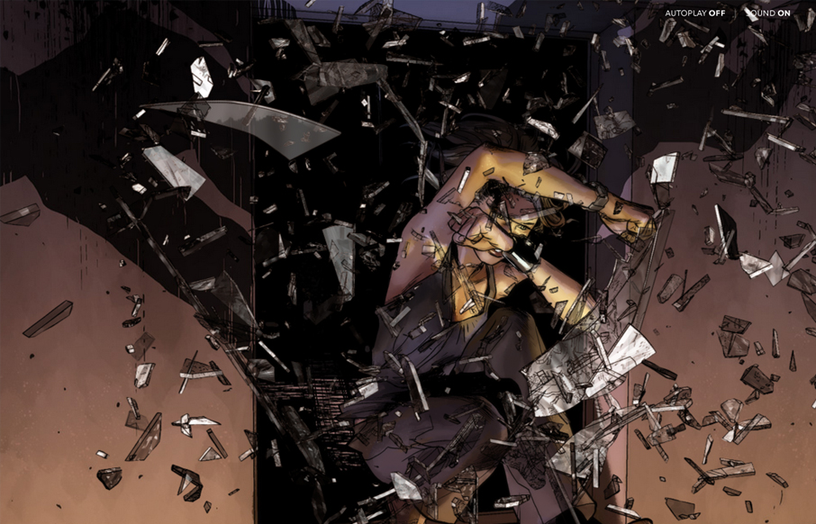
by Giovanni DiFeterici | Mar 11, 2013 | Entertainment, Gallery
I’ve always been a fan of comic books and graphic novels. I’m also a huge fan of experimental projects that push the boundaries of what we think is possible with websites. Peugeot Hybrid4 is a perfect example of one of these sites. The artwork is gorgeous...
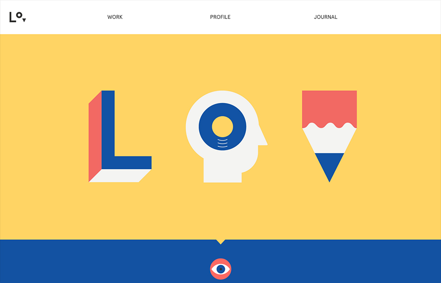
by Giovanni DiFeterici | Mar 8, 2013 | Gallery, Portfolio
lorenzoverzini.com is great. I love this site. Don’t get me wrong, it’s not the most groundbreaking design: minimal, super-flat, graphic, and spare. However, the balance of color, content and style is superb. I love the small SVG animations. They activate...