by Gene Crawford | Feb 20, 2014 | Gallery, Music
There are some really great interactions here. You are rewarded for clicking through the main “what igor is” graphic prompts with great looking illustrations. Very engaging. The second sub-block of what the product is about are also well done. I love how...

by Gene Crawford | Feb 17, 2014 | Gallery
Vimeo’s page to show off the player. Man is it well done and beautifully executed. I love the timed/targeted animations the pages uses to help tell the story about the player. Such a clever way to deliver the narrative here. Keeps me interested all the way down...

by Gene Crawford | Feb 5, 2014 | Gallery
Just a fun addition to the gallery here. I love the parallax vibe connected to the mouse movement. Fun stuff all around.

by Gene Crawford | Feb 4, 2014 | Gallery
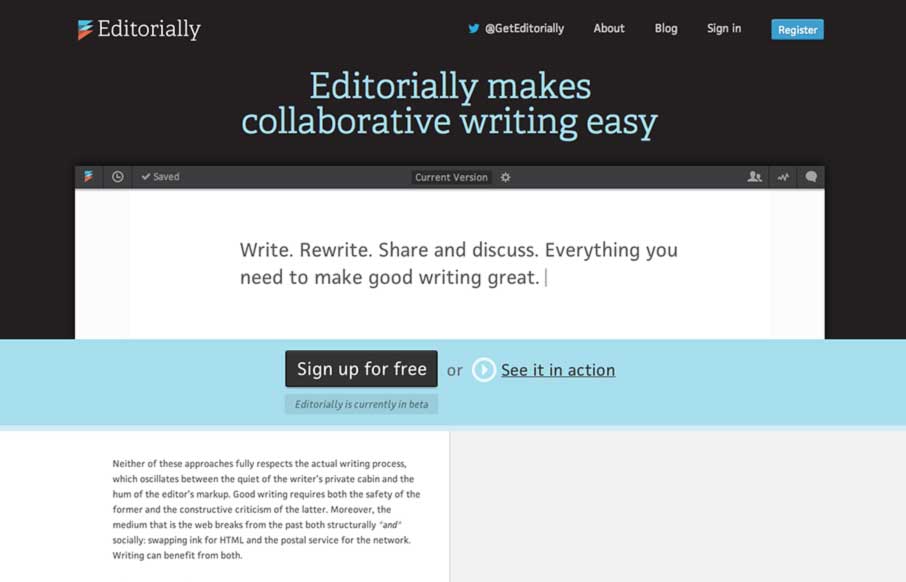
This may not sound like the smartest review; but I love websites that are mostly words and wind up feeling like they are graphically rich. The Editorially site does just that. It’s a website selling and app that’s built for writing where all the crud of a...

by Giovanni DiFeterici | Feb 4, 2014 | Gallery, Sports/Recreation
Curadmir is a whole lot to take in at one glance. It has a lot of visual moving parts and is filled with little visual treats that pop up as you interact with the content. It also utilizes video to nicely create a bit of narrative to the content. It’s also kind...
