by Aaron Griswold | Aug 15, 2014 | Gallery
Thank the gods of the interwebs that there is finally a designer portfolio page that has everything you want in a significant other – smart, beautiful, and funny. We joke around here sometimes that we would like to change the message of our client services...
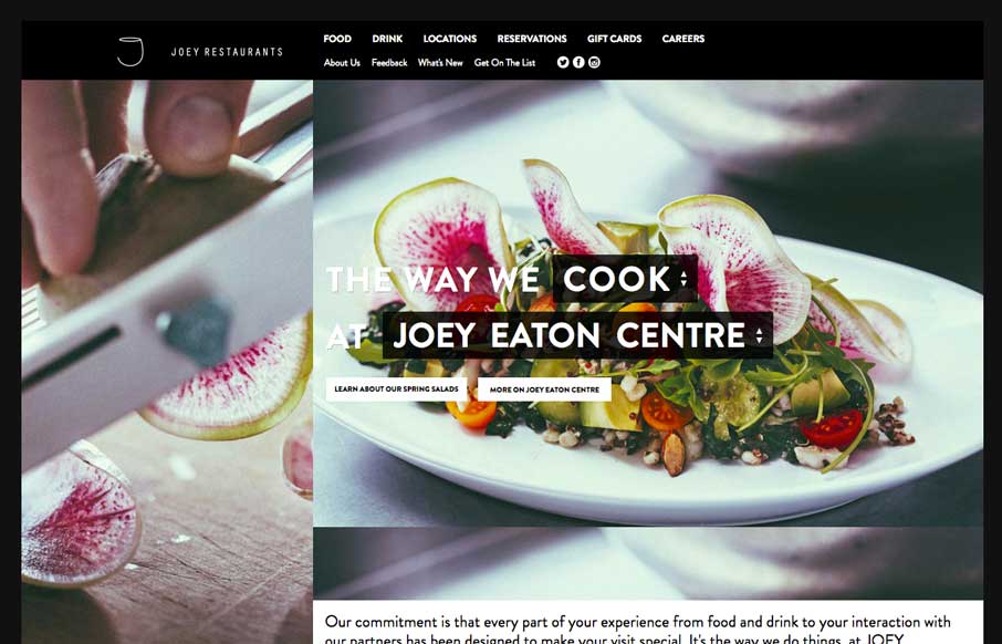
by Gene Crawford | Aug 11, 2014 | Food and Beverage, Gallery
Decent responsive effort on the JOEY Restaurant Group website, it doesn’t appear to scale all the way down past say an iPad width though. I like how they keep the home page short and succinct and stuff.

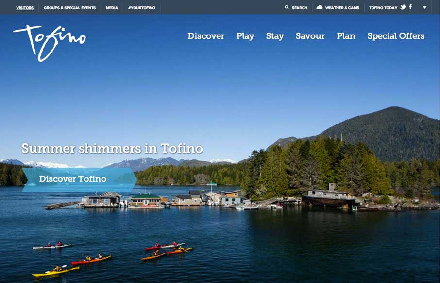
by Gene Crawford | Aug 11, 2014 | Gallery, Travel
Pretty cool grid based layout, very solid. I’m not wild about using the hamburger icon alone as the navigation kick off for all screen widths and stuff. But I do give them points for just sticking with it. Airbus Group (formerly EADS), the largest aviation and...
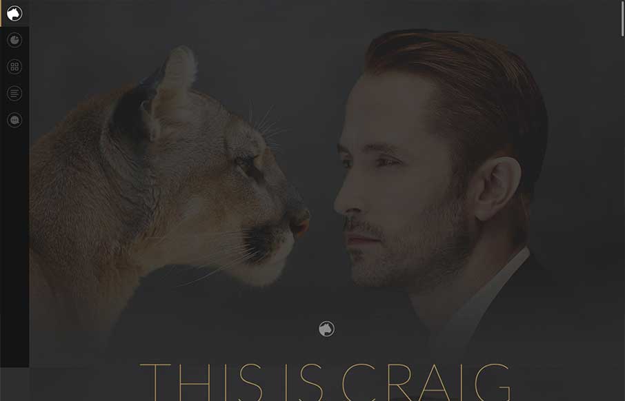
by Aaron Griswold | Jul 30, 2014 | Gallery
Man, what a cool home page. We’re at BDConf right now, and had a few of our speakers talking about the importance of “if you’re going to use animation on your website – use it right” – tell a story with it. This site follows that...
by Aaron Griswold | Jul 28, 2014 | Gallery, Travel
Cool use of different elements and shapes to give clear section delineations on the home / single page design. Also like the only drop-down in the top right corner (arrow) that works as a dashboard for the site. Submitted by: Jim Morris @ventureweb Role:...