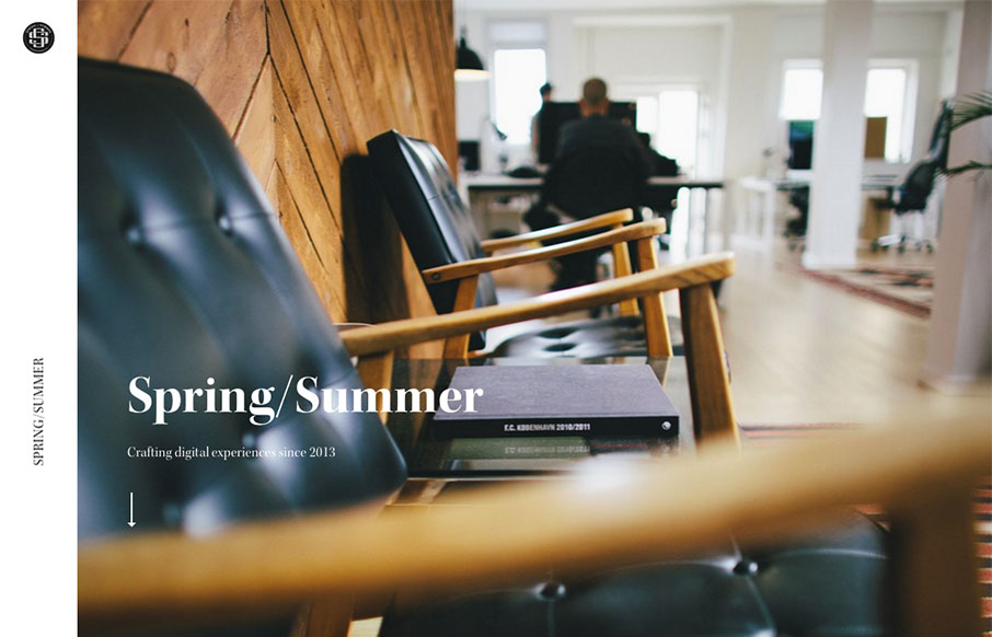
by Gene Crawford | Mar 28, 2016 | Gallery
The first thing that hits you is the photography, it pulls you in. Then there’s some superb typography everywhere. Solid rhythm implied with the layout as you scroll down the page, it almost sings to you as you take it in.
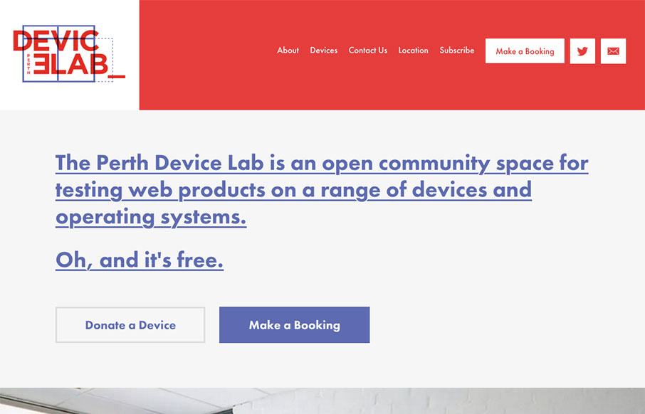
by Gene Crawford | Mar 24, 2016 | Gallery
Damn! Super nice website for the Perth Device Lab. And also, Damn, I want one of these… Seriously, pretty swank site.

by Gene Crawford | Mar 24, 2016 | Education, Gallery
The CrossFit.com website has come a looooong way recently. This design isn’t perfect and I know there has been some hubub on it’s message boards about some UX issues. But really, it’s been optimized for mobile and tablets over desktop users....

by Gene Crawford | Mar 23, 2016 | Gallery
Yep, scroll jacking, but get over it. 🙂 some beautiful screens to look at here and it works pretty well. Especially the main nav once you open it up, simple and to the point.
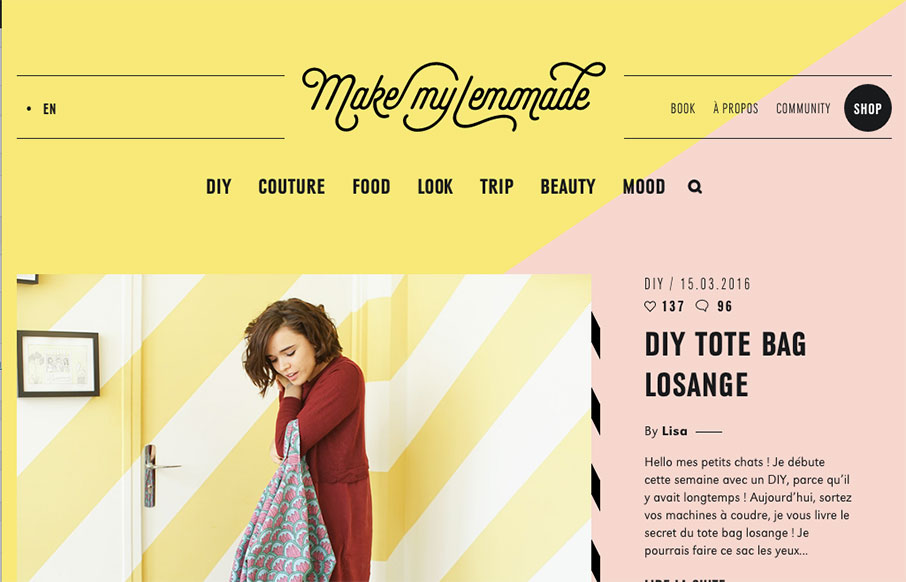
by Gene Crawford | Mar 23, 2016 | Blog, Fashion, Gallery
Make My Lemonade is really just a straight forward blog design, but the details. Oh man, the details. I love all these little things cooked into the design. Like the drop-down style nav menus and the little wing dings here and there down the page. It’s also...