
by Aaron Griswold | May 10, 2016 | Design Firm, Gallery
Ah man – check out this site by Nature Digital out of LA. While I’m not as wild about sites that change the footprint of your cursor, it’s cool here with the video background. But what is really cool is the layout and movement of the case studies...
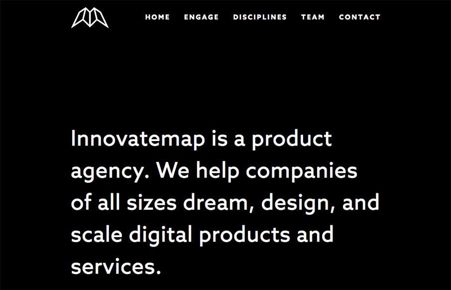
by Gene Crawford | May 9, 2016 | Gallery
Man what a cool website. I love when things can be simply and easily communicated without much fuss (interaction/animation/crazy) and this site does just that. With visual pacing, clever graphic design and layout the Innovatemap site just drives along where it needs...

by Gene Crawford | May 9, 2016 | Gallery, Portfolio
There is some good stuff on this portfolio website for Jacob Stringfellow. I Love the way the logo is intercut like it is with the skyline image. It’s overall a beautiful design as well, each page carefully crafted to look its best. Love it. From the Designer:...

by Gene Crawford | May 9, 2016 | Food and Beverage, Gallery
Solid graphic design for the Fun Beer Tours MKE website. I love the bold graphic look and strong colors. I really dig the call to action too, placed easily noticeable in the center of the page there and very clear and easy to understand. From the Designer: Fun Beer...

by Gene Crawford | May 5, 2016 | Gallery, Portfolio
Pretty clever visuals, simple execution, means I like it. Particularly the Bushido section… Hell that could be the home page really. Love this stuff. Submitted by: Steve Fraschini Twitter: @Novagraphix Role: Designer Country:...