
by Gene Crawford | Jul 29, 2016 | Gallery
Rich looking work. I dig the simplicity of the site and elements. Straight forward and not complex content. Good looking stuff here. From the Designer: We started as a small group ( we are still small ) of designers helping business persons and normal humans to bring...

by Gene Crawford | Jul 29, 2016 | Gallery, Music
This site is pretty weird, but I dig it. I like the colors and the video/imagery. The submitted synopsis really says it all for me: The Charles NYC paired artistic “Low-Tech” photo and animation filters with a combination of retro and futuristic type...

by Gene Crawford | Jul 28, 2016 | Gallery
Beautiful website design for meltmedia. I love every aspect of this website. There’s plenty of little detail work to keep you into it. Like the effect used on the team headshots, love that. Then there’s the case studies too, beautiful look and feel here,...

by Gene Crawford | Jul 28, 2016 | Gallery
It always amazes me when I see a portfolio site like this one for Peter Hol and it’s so simple and elegant and it just works. I love it. Brilliantly simple work always wins. From the Designer: HI, my name is Peter Hol I’m a Dutch graphic and interaction...
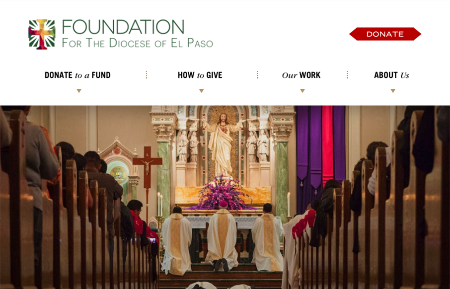
by Gene Crawford | Jul 28, 2016 | Gallery, Nonprofit
Big design here. I dig website projects like this one. Typically plenty of pages to get some good IA work out of it and enough design problems to solve to get all the content bubbled up to the home page. Love this design result here very much. From the Designer: We...