
by Gene Crawford | Oct 15, 2012 | Gallery
Submitted by: Matt Hamm @matthamm Role: Designer & Developer It’s our newly designed responsive website. It’s been 2 years in the pipeline. We hope you like it! Solid responsive design. I’d say two years work is worth it for such a clean and...
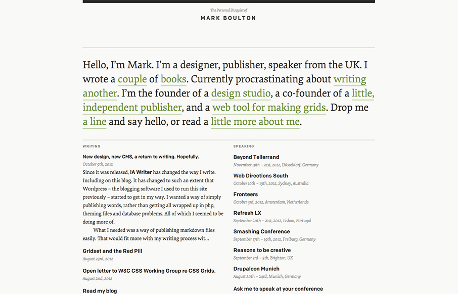
by Gene Crawford | Oct 15, 2012 | Blog, Gallery
I’ve watched Mark Boulton’s blog/site designs over the years make this really refreshing trip towards being completely minimal. I love it. He’s gotten down the just the bare essence of what he needs in a website, particularly with this latest design...
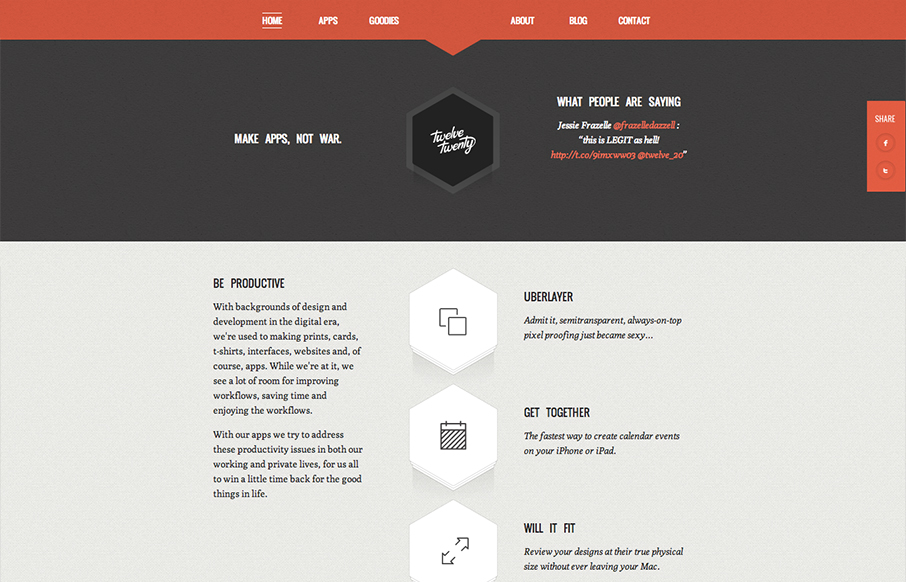
by Gene Crawford | Oct 12, 2012 | Gallery
Really tightly designed website for Twelve Twenty. The little interactions that happen when you mouse over the icons are nice and keep you interested. The overall sharpness and minimal approach of the design mixed with limited color palette make it kind of stick...
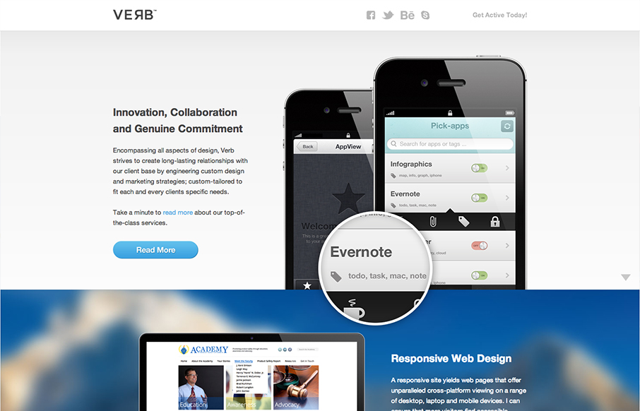
by Gene Crawford | Oct 11, 2012 | Gallery
Submitted by: Alex Deeley @aedeleey Role: Designer & Developer At first I thought the design was for a product, then read the copy and saw it was for a web design firm. I can dig that. Overall it’s a dang fine looking site and I like the slight parallax...
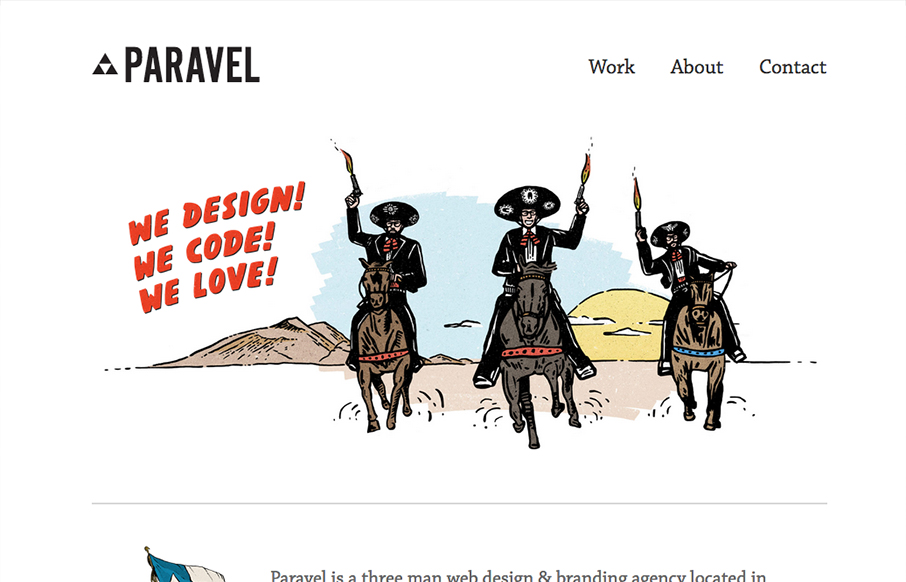
by Gene Crawford | Oct 10, 2012 | Gallery
New update for the Paravel team’s website. They’ve simplified what was there before and boiled it all down to just what’s needed to communicate what it is they do and have done. Telling their story quickly with a super badass illustration. The thing...