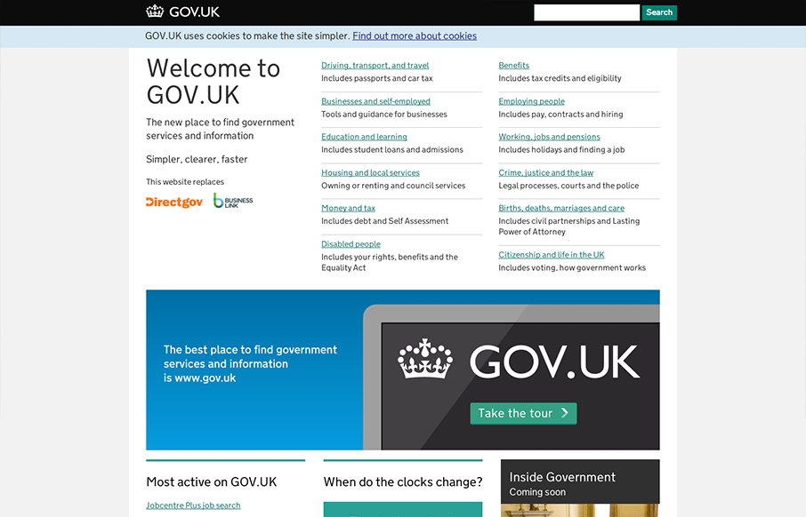
by Gene Crawford | Oct 19, 2012 | Gallery, Government
I absolutely love this design. I’ve tried to accomplish a design like this myself (a site that’s largely a big set of text links) and have fought opposition from management from the client and lost. Makes me very excited to see a solution like this for a...
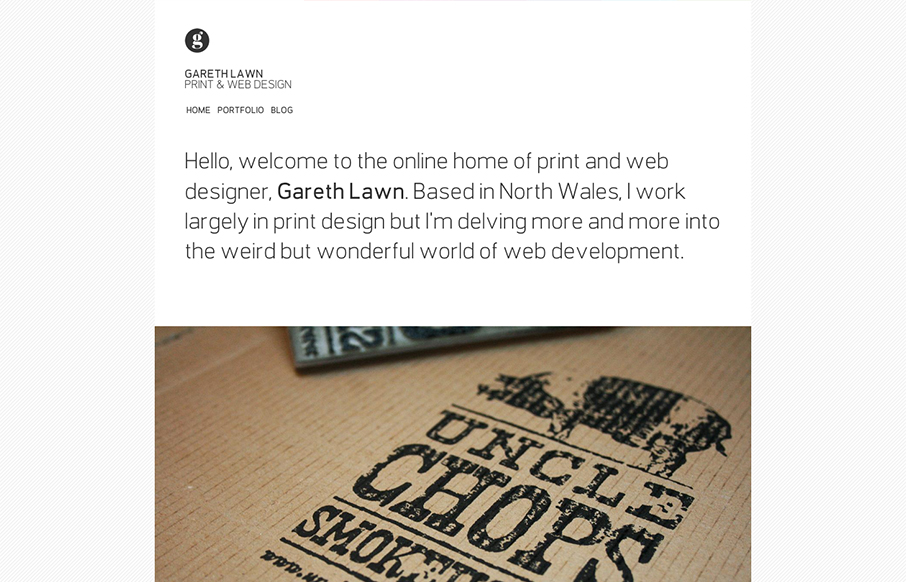
by Gene Crawford | Oct 18, 2012 | Design Firm, Gallery
I like the minimal design for Gareth Lawn’s website. Putting the type front and center with a big central image. Nicely designed responsive solution too.
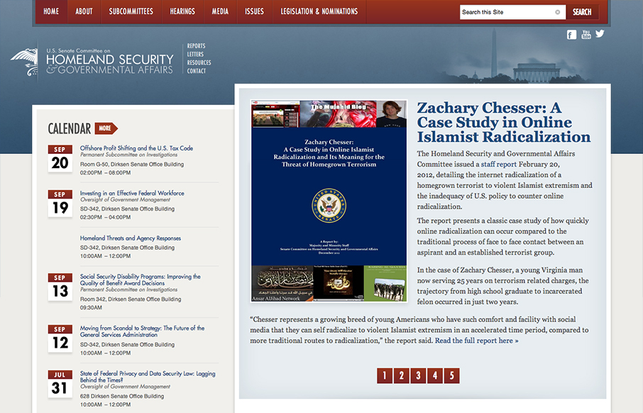
by Gene Crawford | Oct 17, 2012 | Gallery, Government
This responsive design for the Homeland Security site has some really nicely placed breakpoints. I really dig how the layout just really seems to flow so well in between the breakpoints too. Nice clean type and it seems really easy to use on a tablet and iPhone...

by Gene Crawford | Oct 16, 2012 | Design Firm, Gallery
Nice and clean and full of sharp corners but somehow it feels open and inviting to read. Super awesome photography in play makes this site really stand out, when you have photos like these you got to show them off, right? I also like the mouse over zoom effect on the...
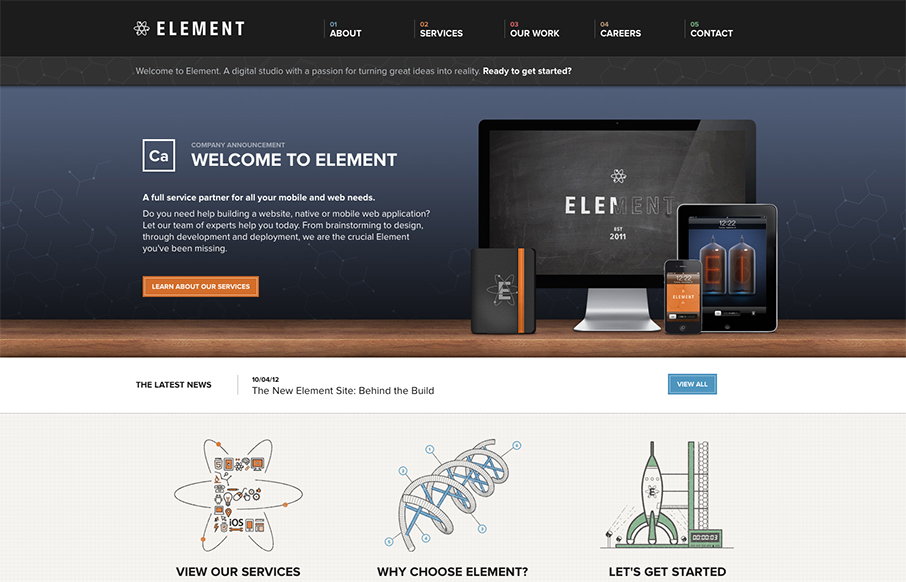
by Maria | Oct 16, 2012 | Gallery
Element has just launched a really well done site. It has all the fancy bells and whistles of a hero carousel, responsive design, and snazzy graphics. What I really appreciate though is how overall what they’ve done is create a mature and solid brand experience....