
by Gene Crawford | Nov 30, 2012 | Gallery
Submitted by: John Ashenden @ashenden Role: Designer & Developer The all-in-one customer support app for small business & teams. Desk approached The BKRY to help lead the redesign and development of both their identity and web site. The project spanned ~3...
by Gene Crawford | Nov 30, 2012 | Design Firm, Gallery
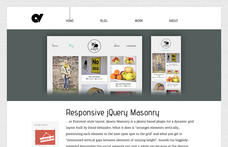
I just love this site design. The minimal color palette and the simple yet deep approach to the layout. The single list of posts on the home page just sings to me for some reason. I think it’s the balance the designer has struck vertically with the layout....
by Gene Crawford | Nov 29, 2012 | Gallery
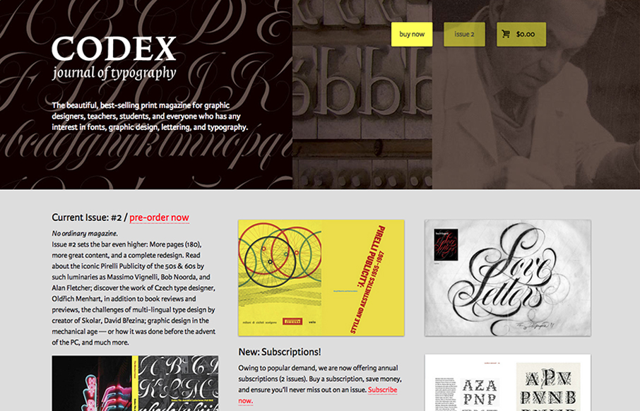
The Codex Magazine website is beautiful. I love the blocks of content on the home page, it’s clear and concisely laid out and all so well balanced. It feels a little asymmetrical but completely balanced evenly. It’s also a really nice mobile layout down to...
by Gene Crawford | Nov 29, 2012 | Gallery, Music
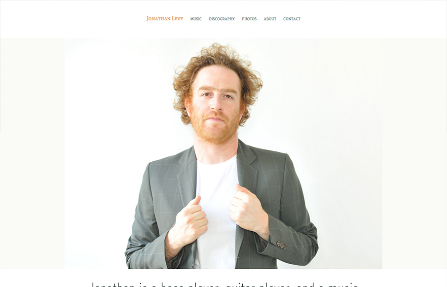
Website by yaronschoen.com The Jonathan Levy site is simple clean and clutter free. I really dig the main photos and how they are carried through the pages of the site, they help sell the character and vibe of the man. I wonder if it was a special photo session just...
by Gene Crawford | Nov 29, 2012 | Community / Social Networking, Gallery
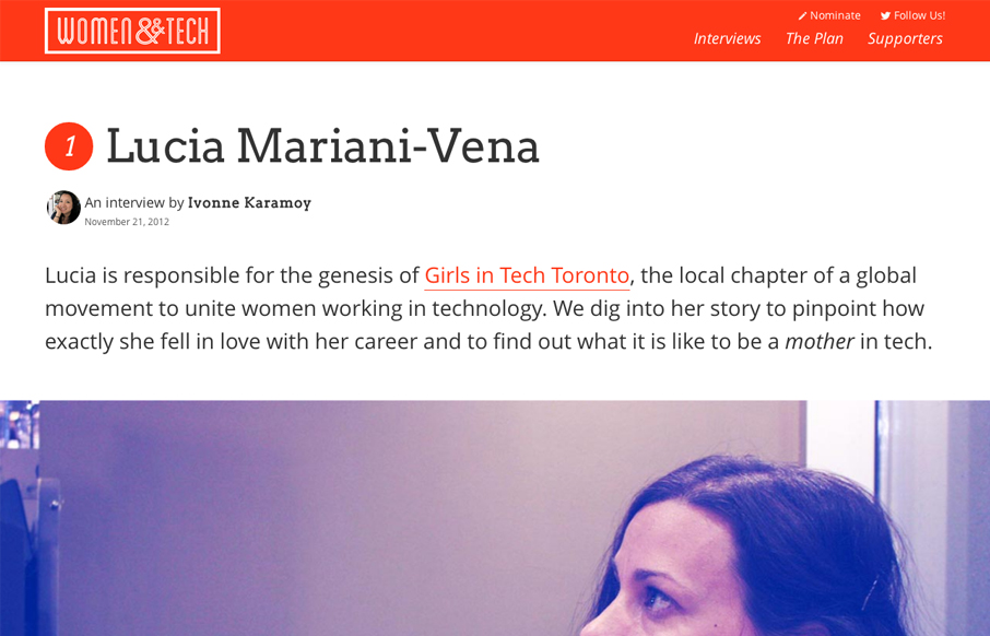
Brilliant layout for the Women & Tech website. It’s a gorgeous long form narrative based content site with a responsive wrapper. I love it. It’s also a really great service for the community at large.