
by Gene Crawford | Mar 3, 2014 | Gallery
Really simple minimal approach done well. I like the logo, then to see it used again on top of the guy’s self-portrait illustration. Nice simple layout that let’s me see the work really fast while looking engaging at the same time.
by Giovanni DiFeterici | Mar 3, 2014 | Gallery, Portfolio
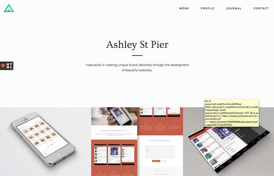
Ashleystpier.com is big and beautiful. This kid is drinking the minimal Kool-Aid and it is working. Very nice portfolio site with minimal detailing and superb balance.

by Gene Crawford | Feb 27, 2014 | Education, Gallery
Really nice Responsive design solution for a major university website. The website is so huge (like most Univ. sites are) that i’m not going to go into any subpage stuff. The main thing I want to point out is the way the navigation is worked into the hero area...

by Gene Crawford | Feb 27, 2014 | Gallery
I really like the overall simplicity in this design. It get’s you to the point really really fast. I think it boarders on being too subtle at times, but that’s not always a bad thing 🙂 I love the visual rhythm in the work page the most. They could keep...

by Giovanni DiFeterici | Feb 26, 2014 | Gallery
The We Are Mammoth website is a simple site that feels tight and focused in content, clear in message and definitive in style. Not much more to say. Good stuff.
