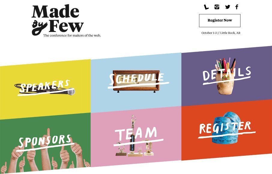
by Gene Crawford | May 7, 2015 | Conference, Gallery
Beautiful website for the Made By Few conference! It’s always a good looking site, but this year they’ve taken it up a notch. I love the hand made elements worked into a solid grid layout like this. All the way to the footer this thing is full of nice...
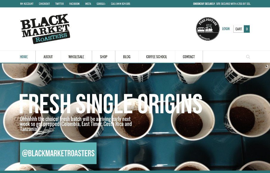
by Gene Crawford | May 6, 2015 | Food and Beverage, Gallery
A strong grid and blocky design elements always make a good pair. Throw in some good photography and you have a winner. From the Designer: We are the dudes that source, roast & deliver fresh roasted coffee. From our base in Sydney, Australia, we run Barista...
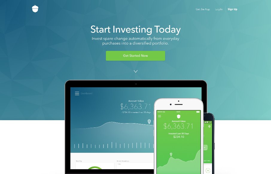
by Gene Crawford | May 5, 2015 | Gallery
It’s a subtle thing but the way the main “hero” image slightly scrolls over the header/display copy is brilliantly done. Then there are other targeted little interactions and animations that really sells the “high class” vibe of this site...

by Gene Crawford | May 5, 2015 | Gallery
This product based website for Haven is beautifully done. I love the large hero style image and the way the elements “load in”. I love the way things appear as you scroll down the page and the blocking of content together the way they’ve done....
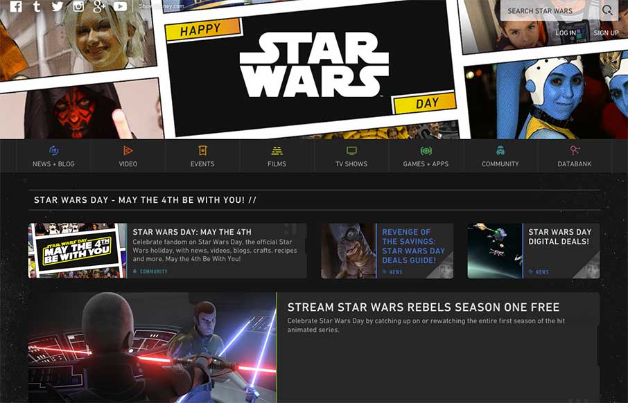
by Aaron Griswold | May 4, 2015 | Entertainment, Gallery
But first – May the Fourth Be With You We plan always review the Star Wars site for May 4th – because, that’s what you do on May 4th if you run a web design inspiration gallery for geeks and nerds all across the universe (or world – we’re...