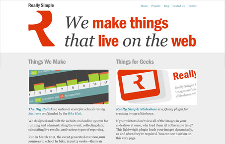
I love this site. I love that the main focus is on typography. That “R” for the logo is very nice. The colors all flow well while looking sort of unique and common at the same time. I really like the “things that inspire us” section – that’s just clever and really lets you get into their collective “heads” a little. Plust responsive design FTW!


0 Comments