
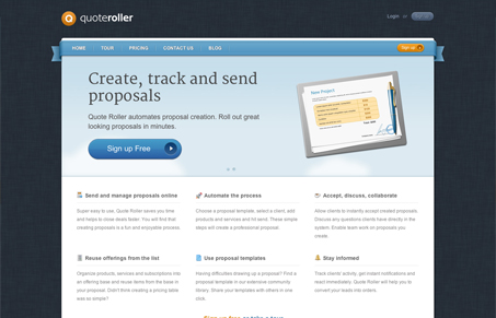
I love the simplicity of this layout and yet there’s a level of complexity here that’s perfect. The call to action is super obvious and classic looking. I think my favorite part is the newsletter signup, the way it’s designed, with the letter graphic behind it is just genius.




Gene,
Thanks for your feedback, we really appreciate it. I’m surprised how close your description is to what we were trying to bring with this design. Probably we did this right if we got such a feedback. 🙂
Thank you,
Serge
Quote Roller co-founder
You bet Serge! I love it!