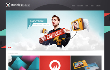
Clean dark background design. I like the sharp angular elements used in the layout. The organgeish reds and greens really make the design look and feel deep. Overall the design is really rather simple, but there’s just the right amount of interaction built in to make it interesting.
Glassmorphism: The Transparent Design Trend That Refuses to Fade
Glassmorphism brings transparency, depth, and light back into modern UI. Learn how this “frosted glass” design trend enhances hierarchy, focus, and atmosphere, plus how to implement it in CSS responsibly.


0 Comments