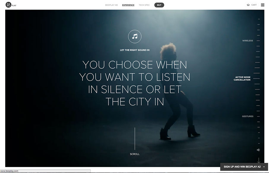
by Aaron Griswold | Jan 13, 2016 | Entertainment, Gallery
This is a great page (and site) from BEOPLAY – beautiful products on a beautiful site. The video and audio, and the way it interacts with scrolling is pretty special.
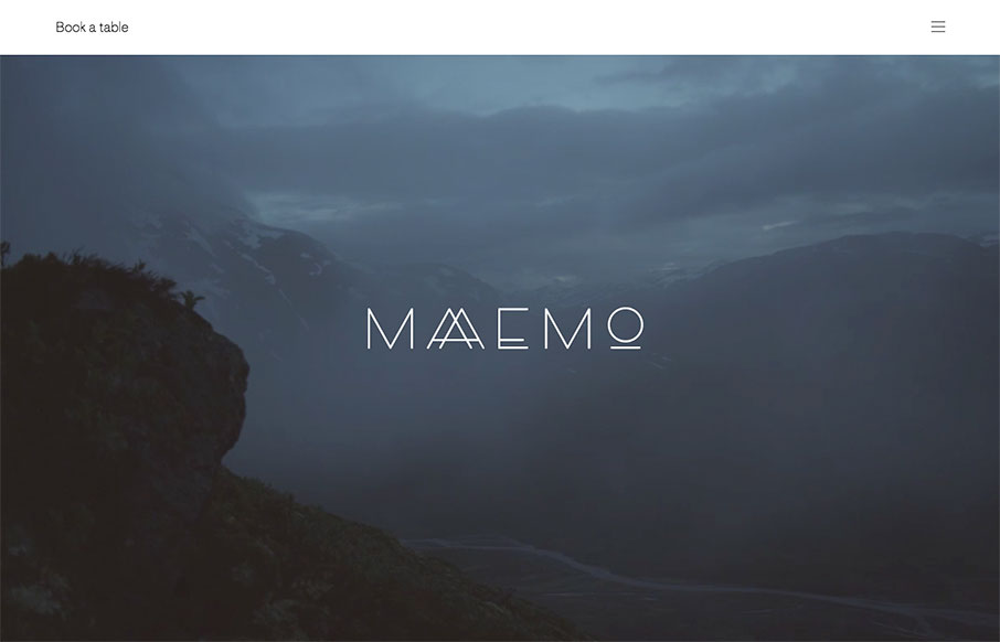
by Aaron Griswold | Jan 12, 2016 | Food and Beverage, Gallery
Love the background video for Maaemo out of Norway – great intro. This site is for a restaurant, so also like that they don’t let you miss that point – booking a table is a must for this place. The rest of the site has great photography on a simple...
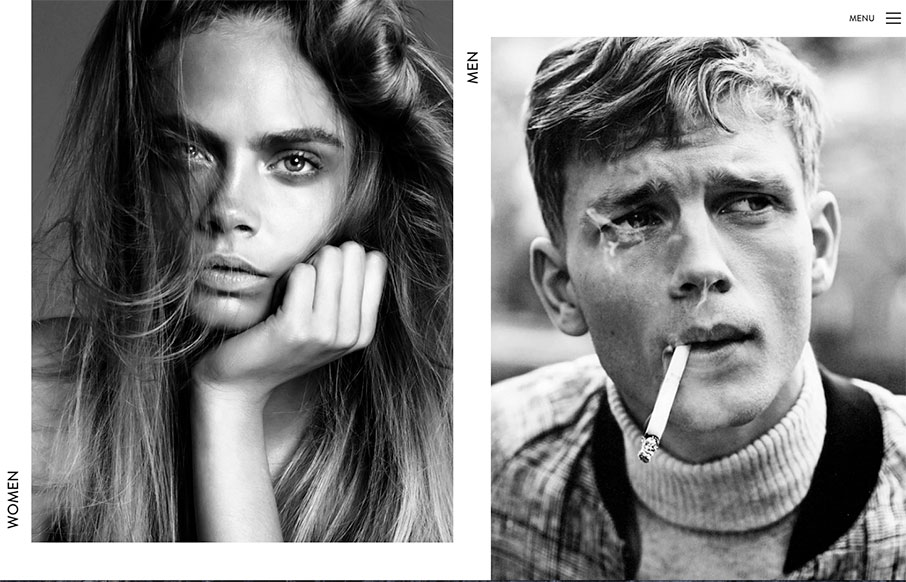
by Aaron Griswold | Jan 11, 2016 | Entertainment, Fashion, Gallery
Classic beauty, with great utility is the look Elite Model in France is going for – it’s a beholder thing obviously, but I like it. Love the A/B navigation using the content to get the info you want: Male / Female – pick one – Mainboard /...
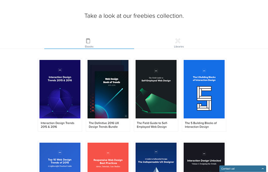
by Aaron Griswold | Jan 11, 2016 | Gallery
So I was doing a little reading this weekend, and I stumbled back on to UXPin. They have an e-book of “The Best Web Designs of 2015-2016” which is excellent work. We’re actually going to use some of their suggested sites in the future, since between...
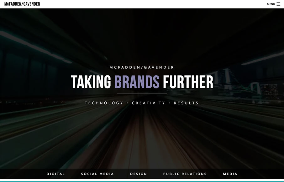
by Aaron Griswold | Jan 11, 2016 | Gallery, Marketing Company
We really like this one from McFadden Gavender out of Tucson because of the awesome video background off what looks to be a elevated train (where though?) – and the good use of muted image / color backgrounds too on the home page. Great first step into their...