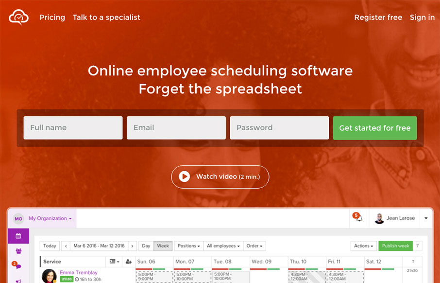
by Gene Crawford | Apr 18, 2016 | Gallery
Well done product website for Agendrix. I dig the way the signup form has been designed the most about this site. The fields are lined up horizontally, giving it a sense of ease or speed to start the signup process. It also has the label “Get started for...
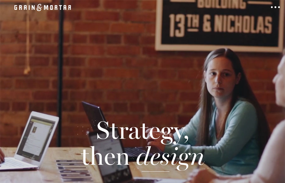
by Gene Crawford | Apr 14, 2016 | Gallery
Beautiful work. I love the feeling of richness this website exudes. From the photography to perfectly selected typefaces to match it’s solid from top to bottom. I especially like the rhythm of the page, going from larger hero sections to smaller more open blocks...

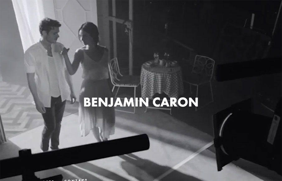
by Gene Crawford | Apr 14, 2016 | Gallery
Real real solid product website here. I dig the overall concept of the way the app is presented. Also the detail work of the slight parallax in the bigger hero views really makes the site sing. The app itself looks beautiful and so the website pulling in some of that...
by Gene Crawford | Apr 14, 2016 | Entertainment, Gallery
Pretty strong layout to go around putting a pretty hefty amount of copy on the page as well as lots of elements and even video. Simple and straight-forward enough to make it all work seamlessly well together.
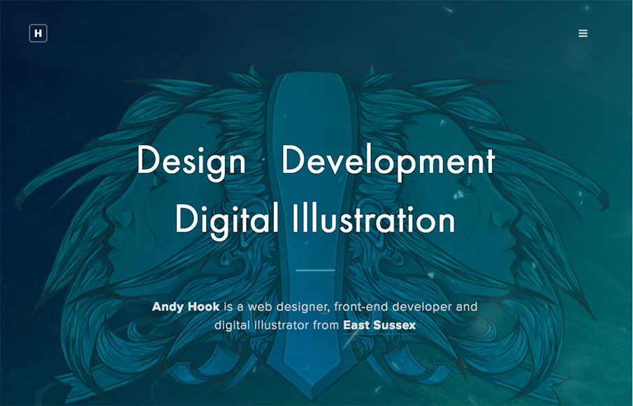
by Aaron Griswold | Apr 13, 2016 | Gallery, Portfolio
Man – another great portfolio site from the UK for Andy Hook. Cool illustrations and great tone to the site. Nice. Submitted by: Andy Hook Twitter: @andy_hook Role: Designer & Developer Country: England