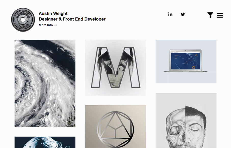
by Aaron Griswold | Apr 13, 2016 | Gallery, Portfolio
I kind of love this portfolio site from Austin Weight out of London. Scroll over the work samples on the Home page – very cool effect that we haven’t really seen much of yet. Also really like the work he did on “The Connection – Scales of...

by Aaron Griswold | Apr 13, 2016 | Gallery
Good, clean site out of the Ukraine for Pixons. I like the block design and work on the Projects page especially – good balance with imagery and descriptive text. From the Designer: This is our company brand new website. We build digital products & services....

by Gene Crawford | Apr 12, 2016 | Gallery
Solid, simple 3 column based layout. Dark background is good as well. What I love most and what IMHO really sets this website off into orbit is the navigation design/interaction. I freaking LUUURRRVE this thing! A personal portfolio design is never an easy task. 5...

by Gene Crawford | Apr 12, 2016 | Gallery
Pretty straightforward design. It isn’t perfect but it does have several cool details that are worth reviewing. From the Designer: Intcore is one of the Egyptian leading companies in software development and media production that working hard to meet all...

by Gene Crawford | Apr 12, 2016 | Gallery, Portfolio
Nice portfolio site for James here. I love the green background/shapes and the way the portfolio pics overlap slightly. Very clean layout and I loves it! Also, he’s running a marathon, so give the man some support! From the Designer: A responsive portfolio...
