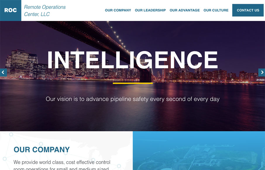
by Gene Crawford | May 3, 2016 | Gallery
Pretty cool layout for the Remote Operations Center website here. I love work like this, because it looks like straight up client work and there are always limitations and such with client work. I love seeing what a designer can do with something like this. Win! One...
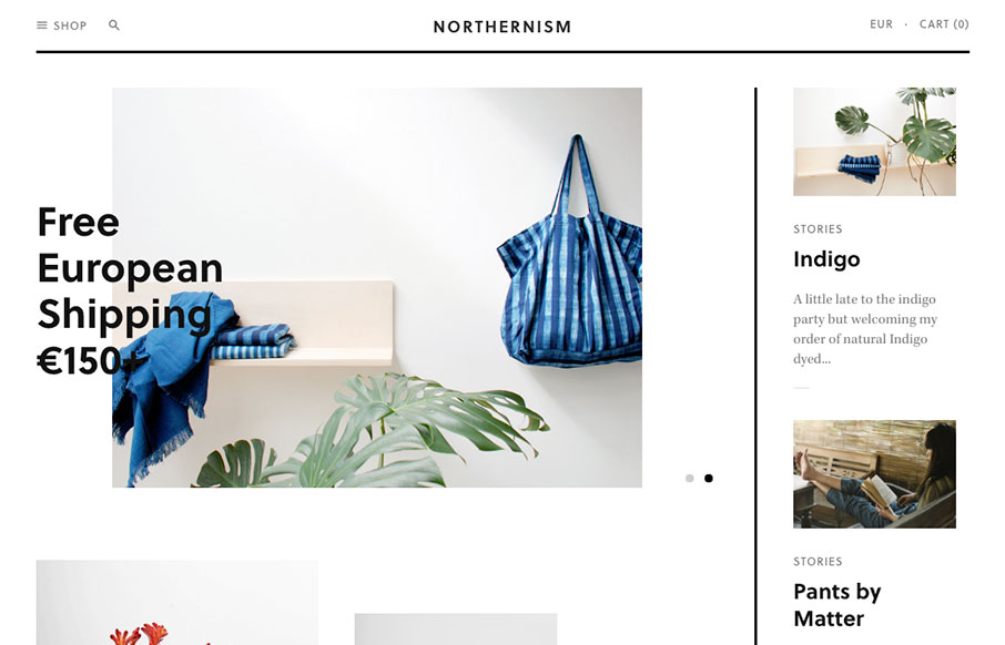
by Aaron Griswold | May 3, 2016 | Gallery, Shopping
Cool and minimalistic – appropriately titled Northernism, this site is for eclectic online shopping out of Amsterdam. Custom Shopify theme – nice. From the Designer: An online store, based in Amsterdam-North, presenting a curated selection of new, found...
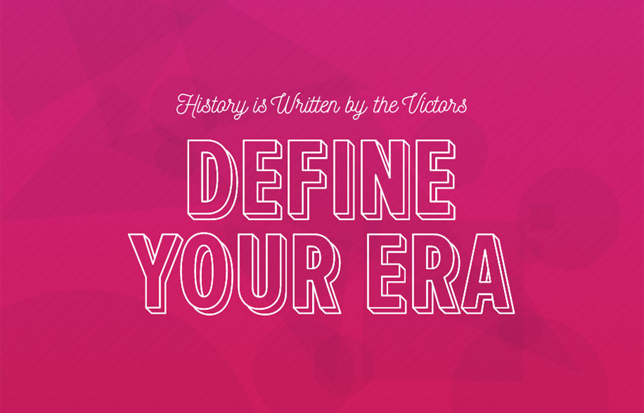
by Aaron Griswold | May 2, 2016 | Gallery
Sweet intro on this site by Untitled Era out of Brooklyn. Also really love the action that happens after you click the hamburger – nice animation work all the way through! From the Designer: Custom designed and developed WordPress website for Untitled Era, a...
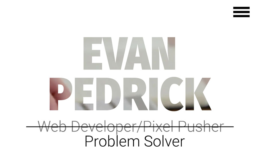
by Gene Crawford | May 2, 2016 | Gallery, Portfolio
Man I dig this layout. It feels very original and open, the graphics are relatively neat too, especially the main blueprint background imagery. From the Designer: This is my personal portfolio website. It has been designed and built by hand from the ground up. The CSS...
by Gene Crawford | Apr 28, 2016 | Gallery
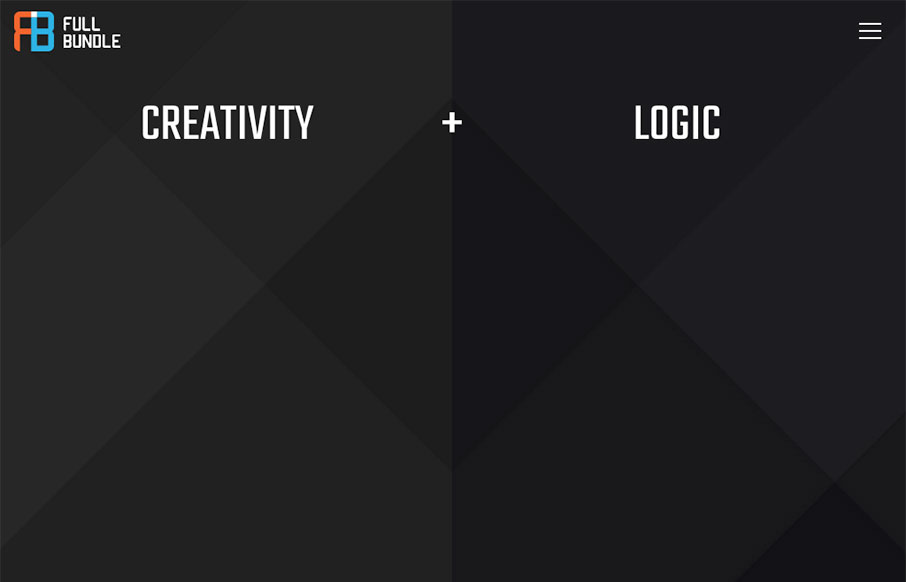
Really fun website with a fairly minimal base. I love the way the bits of design float up or away from your mouse when you interact with the website/screen. The content sections are solid examples of design too. Great visual work here. From the Designer: Full Bundle...