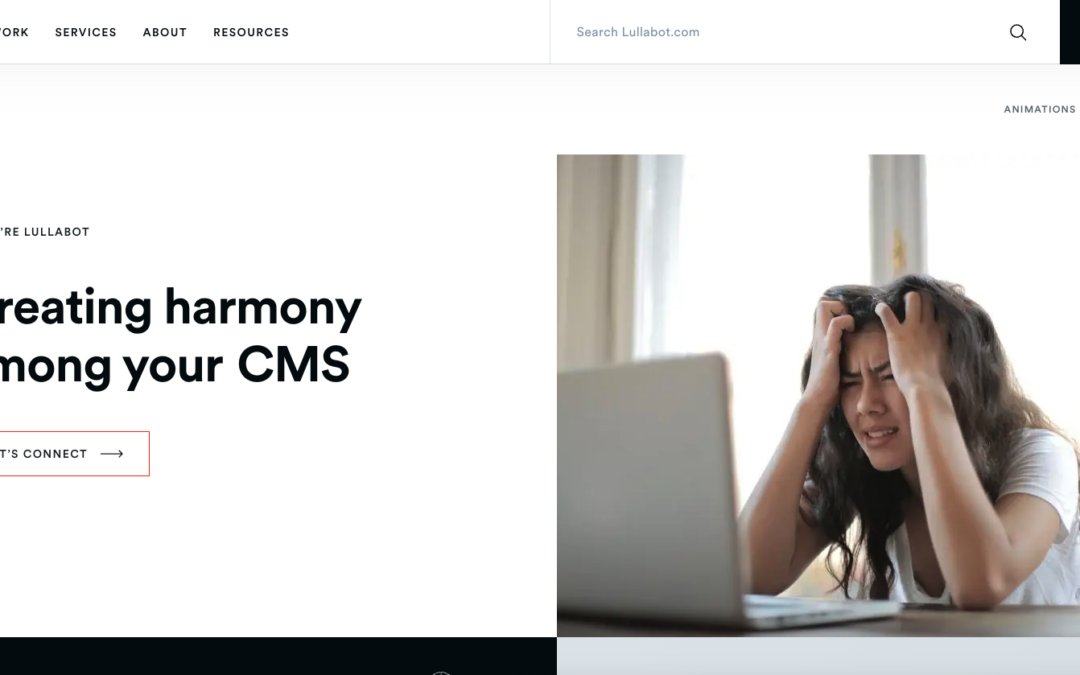
by Gene Crawford | Aug 31, 2023 | Design Firm, Gallery
Been a fan of Lullabot for a long time. Recently checked out their website and it made me so happy. Very nice clean and crisp solid layout with snappy load times and responsive views. Love it.
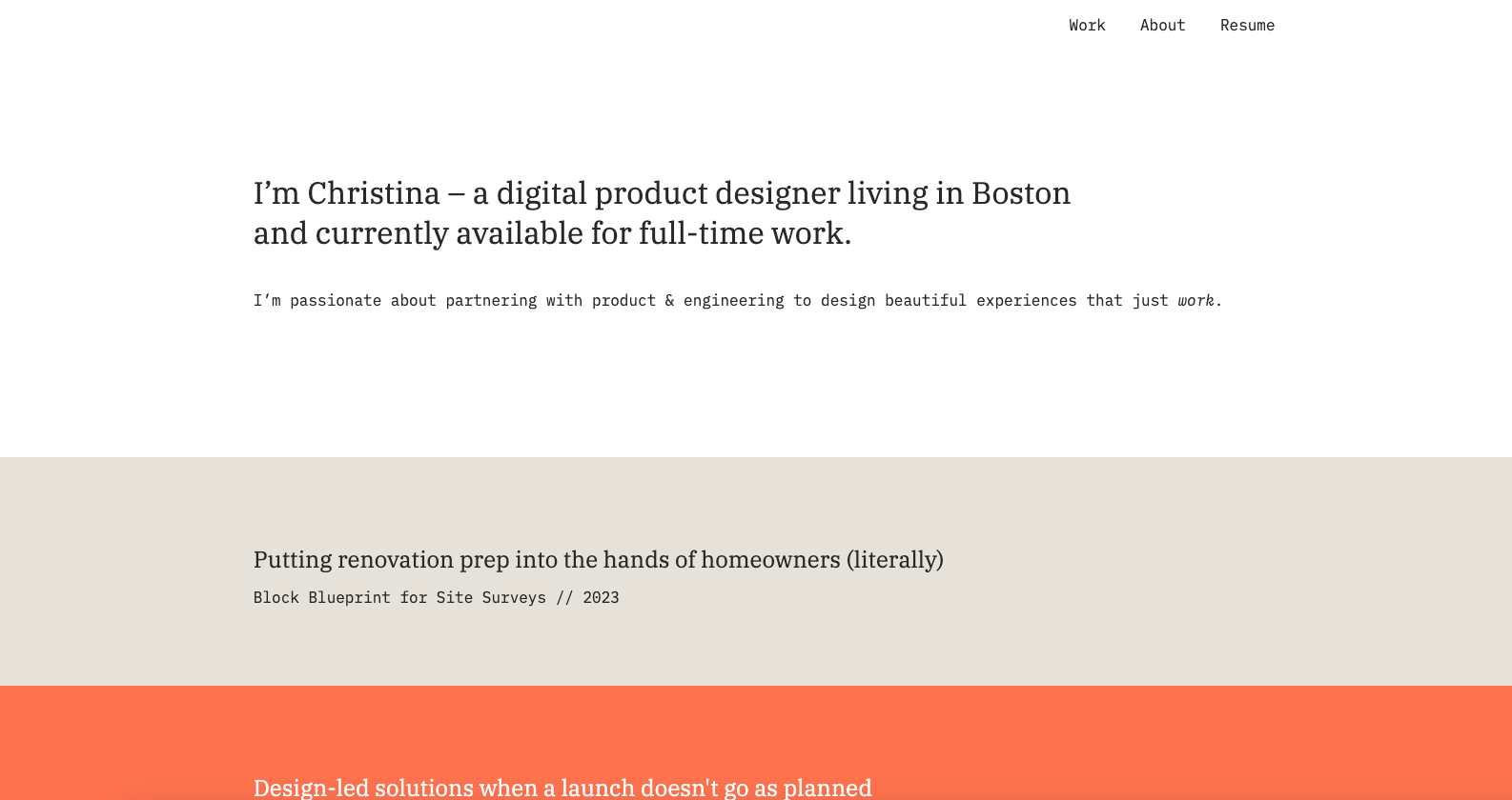
by Gene Crawford | Aug 30, 2023 | Design Firm, Gallery
Another great example of a minimalist design. It takes the right project to be able to employ minimalism in such a great way – often it’s a portfolio or resume website.
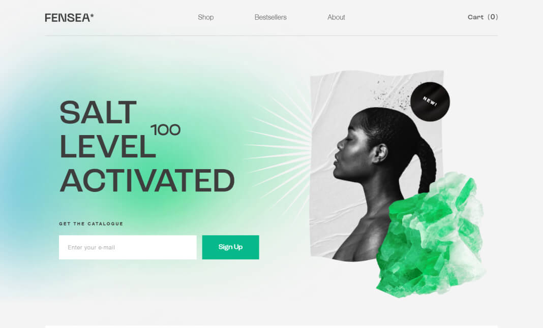
by Gene Crawford | Aug 28, 2023 | Gallery, Marketing, Product
A concept of the Fensea brand is inspired by the extensive benefits of sea salt. Sea salt has firmly entered into modern cosmetology, as it helps to solve many problems associated with the face and the whole body.

by Gene Crawford | Aug 25, 2023 | Design Firm, Gallery
Love this personal/portfolio website. The movement around the interactions just feels great. The minimal approach also really allows the interaction to be noticed and enjoyed. This made me smile to click around. 🙂
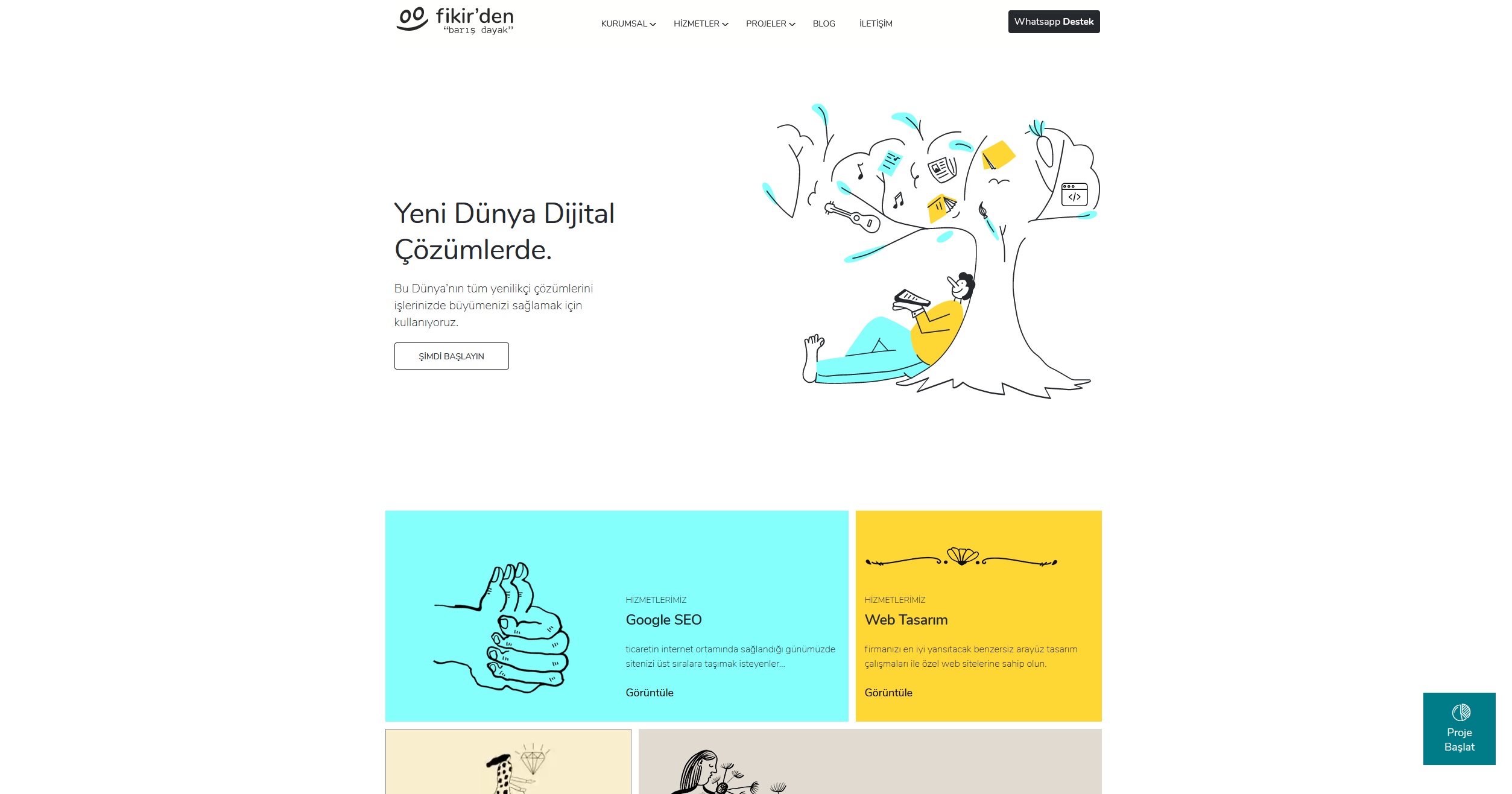
by Gene Crawford | Aug 23, 2023 | Design Firm, Gallery
I like the feel of this design. It feels kinda like a toy or plastic somehow. Nice illustrations and layout too.