
by Gene Crawford | May 14, 2012 | Conference, Gallery
The Go Beyond Pixels website is clean and minimalist, yet it’s beautifully designed with excellent elements throughout the site. The site uses customs fonts which make it that much more unique. The use of icons and clear copy makes it a site that you want to...
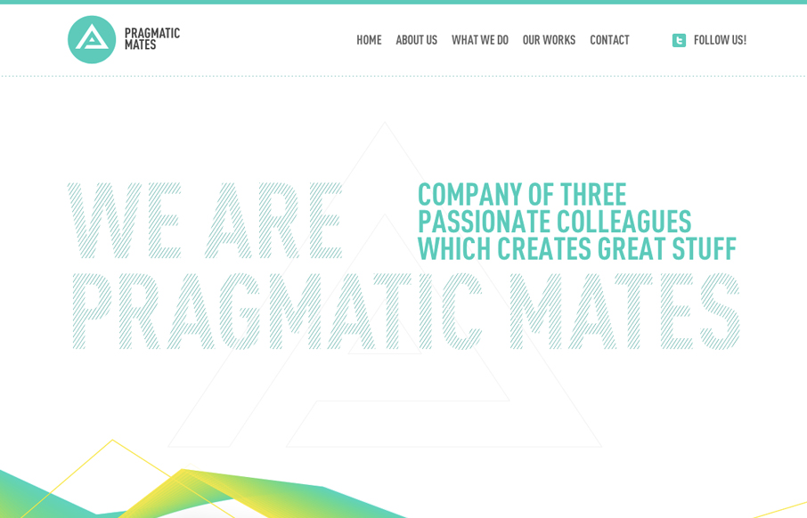
by Gene Crawford | May 14, 2012 | Gallery
Submitted by: Lukas Vinclav Role: Developer What a great scrolling site design. I really like the interaction of the main navigation and the targeting of the content section on the page. The slight movement and readjustment is a very nice touch. The colors are really...

by Giovanni DiFeterici | May 10, 2012 | Entertainment, Gallery
Wow. What a visual feast. The lush layouts are highly reminiscent of upscale magazine design. I find designs like this, ones that emphasize visual design over interaction, are often the most dynamic. Each page is unique and varied. Some pages are massive splash images...

by Gene Crawford | May 9, 2012 | Education, Gallery
Awesome concept and beautiful execution of this website. The responsive design details are nice and worth a study. I particularly like the fixed header and the “contact” link interaction. The signup page is also very nicely done. A super clean and minimal...

by Gene Crawford | May 9, 2012 | Gallery
Really nice announcement website design for pixelivery.com. It has just enough info to entice you and the interactions with the scrolling links and responsive design are cool – which is what this needs to get you interested. Me. want. Shirts. Too!
