by Gene Crawford | Dec 4, 2012 | Design Firm, Gallery
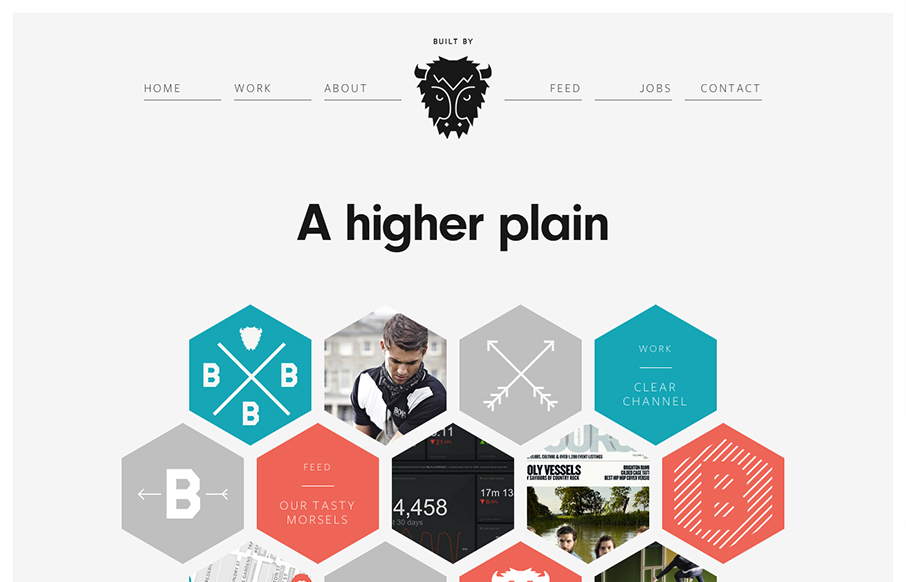
I LOVE the new Built By Buffalo design. So clean and sharp. The hexagon shapes feel very new compared to other sites too. Slick responsive design solution that’s just as clean and concise as other screen width versions of it. Beautiful! Ascii buffalo head...
by Gene Crawford | Dec 4, 2012 | Gallery, Portfolio
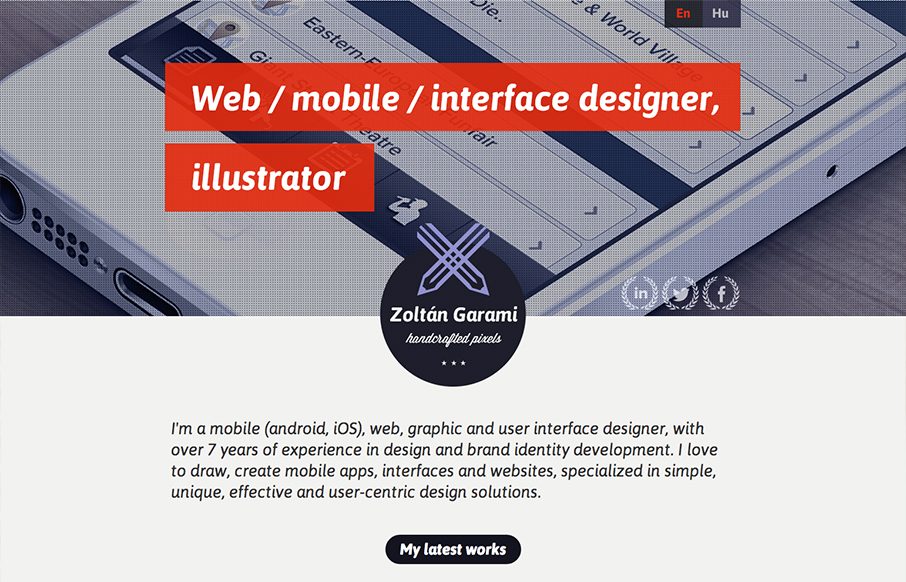
Submitted by: Zoltan Garami @garamiz Role: Designer I like the placement of the red behind the white text that’s over the monochromatic image. I know it’s simple and been done before but it’s nicely done here and I just like it. The logo is nicely...
by Gene Crawford | Dec 3, 2012 | Gallery, Portfolio
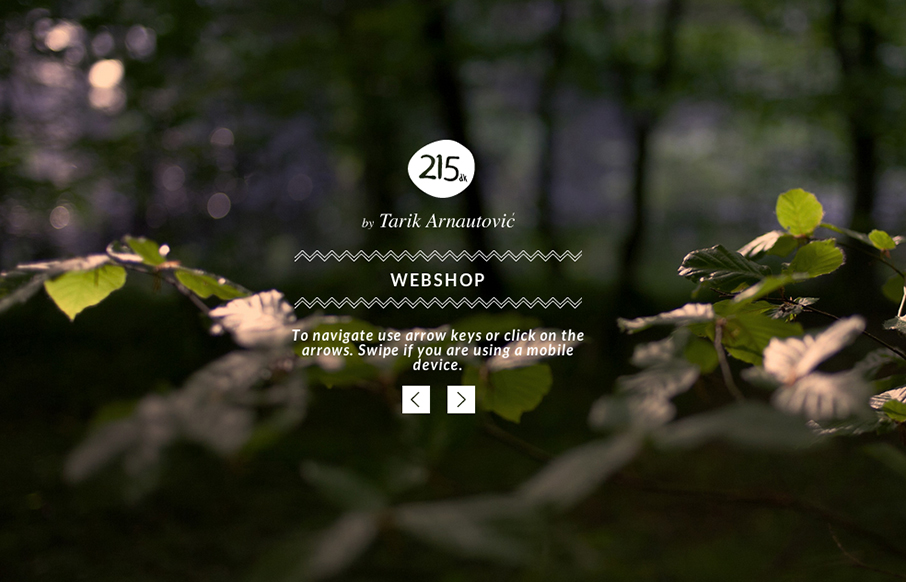
I love subtle design and this site is a perfect example of that. The left right arrows that match up with the keypad, then the simple placement of interactions/controls. Like when you click on menu and the big X is over the content of the previous page/view. Love it....
by Gene Crawford | Dec 3, 2012 | Gallery, Portfolio
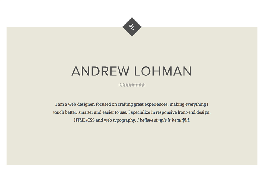
Submitted by: Andrew Lohman @ajlohman Role: Designer & Developer A simple responsive personal site with some nice little details. Really brilliantly simple design. I love how the logo stays put as you scroll down the page, disappears behind the portfolio section...

by Gene Crawford | Dec 3, 2012 | Gallery
The new An Event Apart site had landed. It’s a well done example of clean design and responsive/mobile-first implementation. I think we’d all except no less from the masters themselves. They’ve given us a nice writeup on the site re-launch on their...
