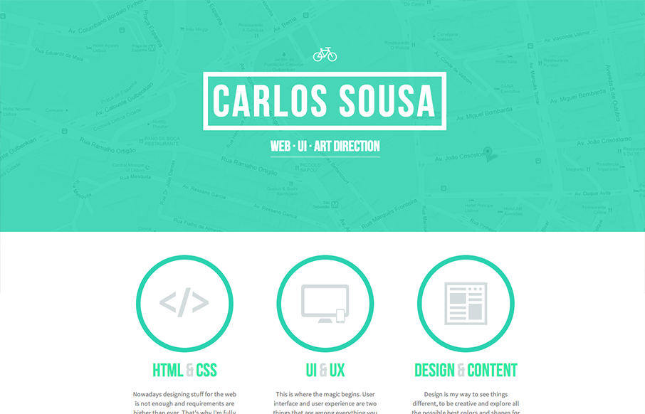
by Gene Crawford | Apr 17, 2013 | Gallery
I love the solid blocky feel to the elements on the page here. The rich graphic vibe and the limited color palette make for some nice design in this case. The little interactions are also well used and not overly so.

by Gene Crawford | Apr 16, 2013 | Gallery, Portfolio
Nice simple display of the artist’s work with a clean grid and minimal color palette. But it’s the little details, the RWD and the interactions on the title shapes that complete the design and make it feel so finished and polished. Great work here....

by Gene Crawford | Apr 9, 2013 | Gallery
I love the start graphic feel to this site and the minimal color palette is just great. The lead in animation with the logo and slide up to the fixed navigation give this site a nice vibe of technical sophistication. I also like the clearly differentiated sections of...

by Gene Crawford | Apr 9, 2013 | Gallery
This website for Facebook Home is just a visual feast. Yes, it has all the Facebook visual brand baked in but it’s beautiful. The video in the background for the top of the page and the slide up fixed navigation design bringa nice level of fancy to this simple...

by Gene Crawford | Apr 8, 2013 | Gallery, Portfolio
This site feels pretty smooth/slick to use. I like the slider on the home page and the way the nav slides up to be fixed in position. Then all the sub pages are well designed and cleanly executed. I like this less is more approach to the layout with the nice...
