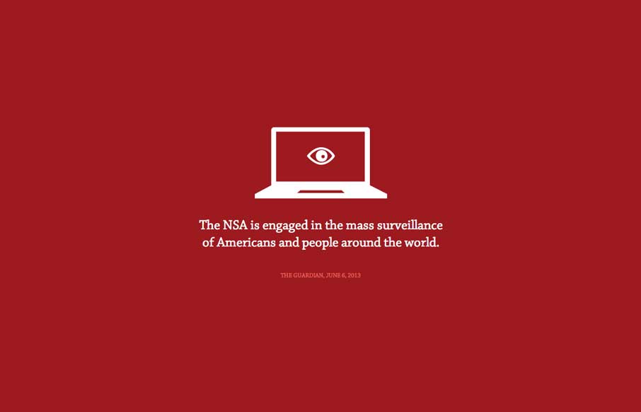
by Gene Crawford | Feb 24, 2014 | Gallery
The Now Way NSA page is largely a big infographic/news piece. It’s worth a look through other than to review the design of it, but the design of it is great. Now go and get enraged at the NSA.
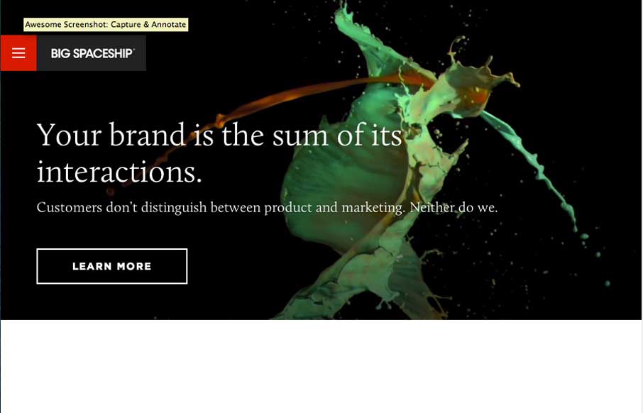
by Gene Crawford | Feb 21, 2014 | Gallery
Very cool and slick looking design studio website. I love the main nav design too, how it takes over the design of the page but is super snappy and responsive to your interaction. The fixed logo/nav block that floats in the same position as you access sub pages is...
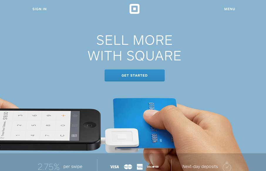
by Gene Crawford | Feb 20, 2014 | Gallery
The updated Square website (it’ll probably change a bit by the time we post this) is excellently done. The main top section is used to tell the story of what’s going on right now with square. Usually involving some sort of tricky interaction or animation....
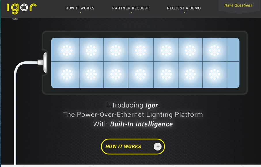
by Gene Crawford | Feb 20, 2014 | Gallery, Music
There are some really great interactions here. You are rewarded for clicking through the main “what igor is” graphic prompts with great looking illustrations. Very engaging. The second sub-block of what the product is about are also well done. I love how...
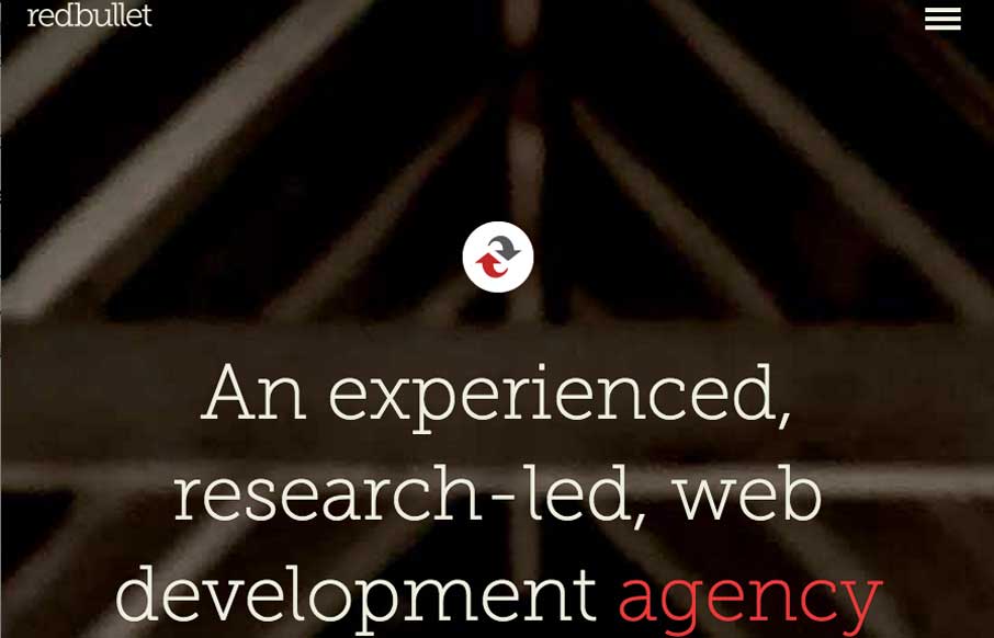
by Gene Crawford | Feb 19, 2014 | Gallery
Nice minimal(ish) design. I really like the interaction where the top nav area get’s highlighted by changing to a red background only when you scroll back up. Just to give you that hint that it’s there. Then the hamburger icon leads to one of those full...