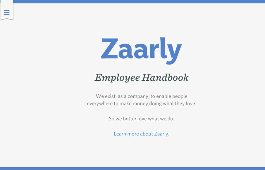
by Gene Crawford | Mar 6, 2014 | Gallery
Nothing super rule breaking about this but it’s become commonplace for companies to put things like their employee handbook or benefits info on a website or resource like that. The Zaarly Employee Handbook is just sexy. Nothing more needed to say about it other...
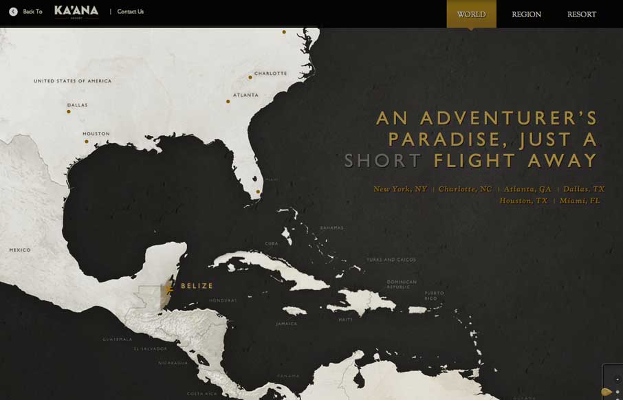
by Gene Crawford | Mar 5, 2014 | Gallery, Travel
I can’t recall where I saw this description for the map design from first (if it’s you please let us know in the comments below) but I it sums it up perfectly: Awesome interactive travel map for Belize. Featuring three levels of zoom with css animations,...
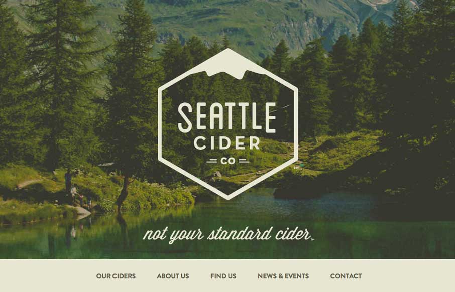
by Giovanni DiFeterici | Mar 5, 2014 | Food and Beverage, Gallery
The Seattle Cider Company website uses flat illustrations and simple interactions to control the narrative of the cider making process. The design style is hip and minimal with a few nifty tricks (like the slide-in fixed nav) and a lot of character. The narrative...
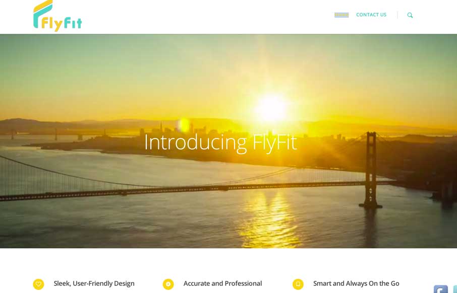
by Aaron Griswold | Mar 5, 2014 | Gallery, Marketing
This is a fast loading video based site that was made for a large screen. It has subtle parallax elements that don’t detract from the main video feature of the site. They could probably go with a cleaner social media linking system, but since it’s a new...
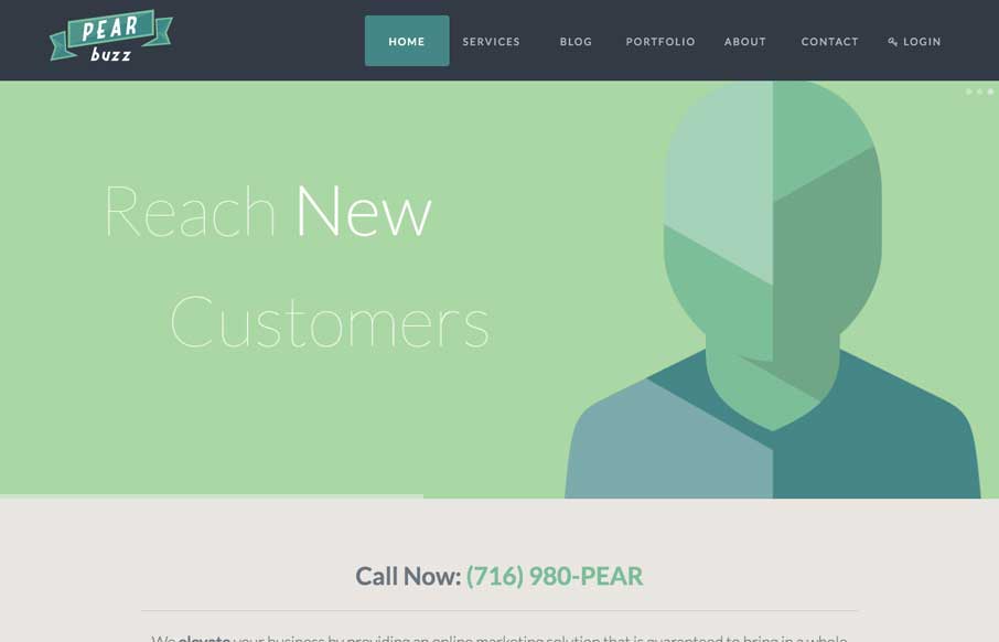
by Gene Crawford | Mar 4, 2014 | Gallery, Marketing
Love the colors and icon/illustration work on this site. The layout is pretty formulaic by design trend standards but sometimes that’s okay and with well designed elements you can really make things sing.