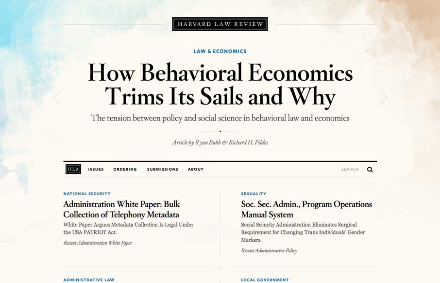
by Maria | Apr 22, 2014 | Gallery
I wasn’t expecting to see something as remotely beautiful as the home page of the new Harvard Law Review site. It’s rich yet lean, and really pushes the limits of typography successfully. The background graphic elements frame the page nicely. It’s curious that...

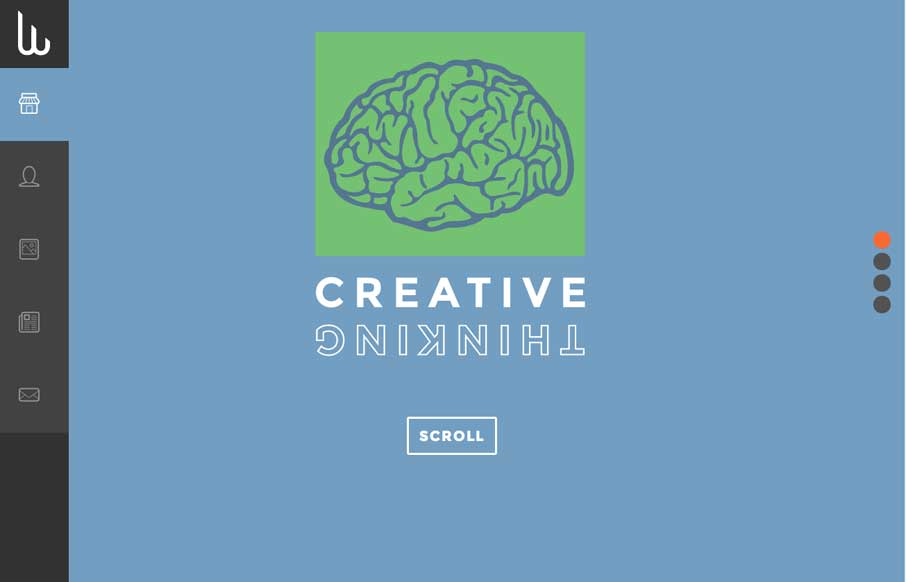
by Aaron Griswold | Apr 22, 2014 | Gallery
When I first looked at the site, I thought, hmm.. that’s a little too simple – one picture, no scrolling.. what gives. Then I clicked on the navigation and realized it’s a different spin on the single page website that is real trendy lately. Instead...
by Aaron Griswold | Apr 22, 2014 | Gallery
I just replied to a comment about one of the sites we reviewed a week or two ago, while I was starting to write this review. The other site was beautiful, with every whiz-bang feature you could think of, but very laggy. Then I looked at Andy Cracicle’s...
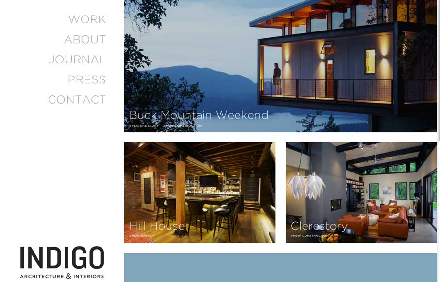
by Gene Crawford | Apr 21, 2014 | Gallery
Clean and straightforward. That’s what I think a lot of the best architecture is all about. These guys website tells that story to me. It’s clean and simple, even in the way the responsive design is approached. Nice work.

by Gene Crawford | Apr 18, 2014 | Gallery, Sports/Recreation
I like this site because of the vibe it has. It totally makes me want to go jump in the ocean, right now. Also I find myself drawn into finding out more about this guy and what he does. Good stuff.