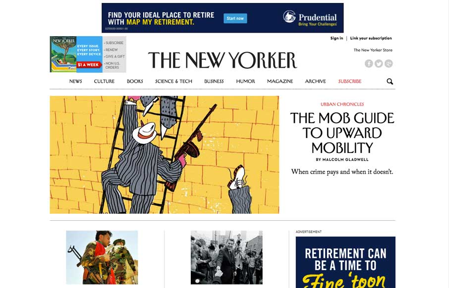
by Aaron Griswold | Aug 6, 2014 | Gallery
We’ve watched over the years as purveyors of print have made uneasy transitions to the web. Last week, the redesign The New Yorker’s website shows they’ve worked hard to translate their magazine into the modern interwebs. Great use of the images and...
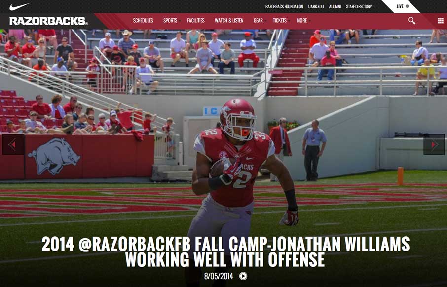
by Aaron Griswold | Aug 6, 2014 | Gallery, Sports/Recreation
Football (Gridiron) season is in a couple of weeks. Even though this isn’t my favorite team, really like their website. The large images and videos give it a bold and loud feeling, that translates really well if you’re a fan.
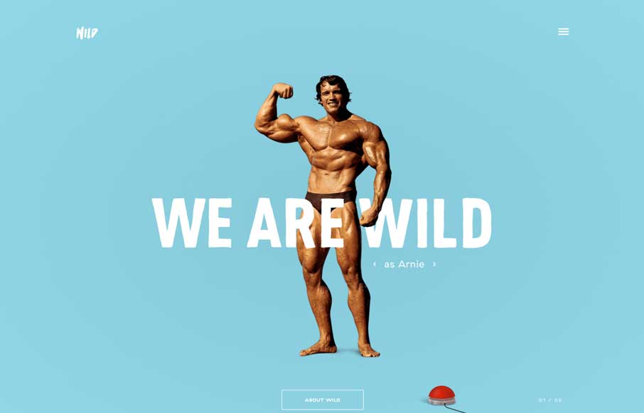
by Aaron Griswold | Aug 6, 2014 | Gallery
Um… yeah… where to start? Astronauts rotating around text? Parallax of a boxer being counted out? Wild navigation scheme that makes it fun to move around the site? Hamburger icon that animates into an X? Or the easter egg of all easter eggs – Arnie,...
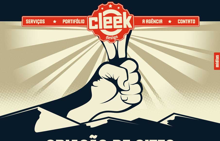
by Aaron Griswold | Aug 5, 2014 | Gallery
Neat, one page agency site that looks like a poster – a poster with css animations and hints of parallax. It’s a different style than most agencies use, adding some uniqueness to the agency site landscape. Plus – what other sites have a...
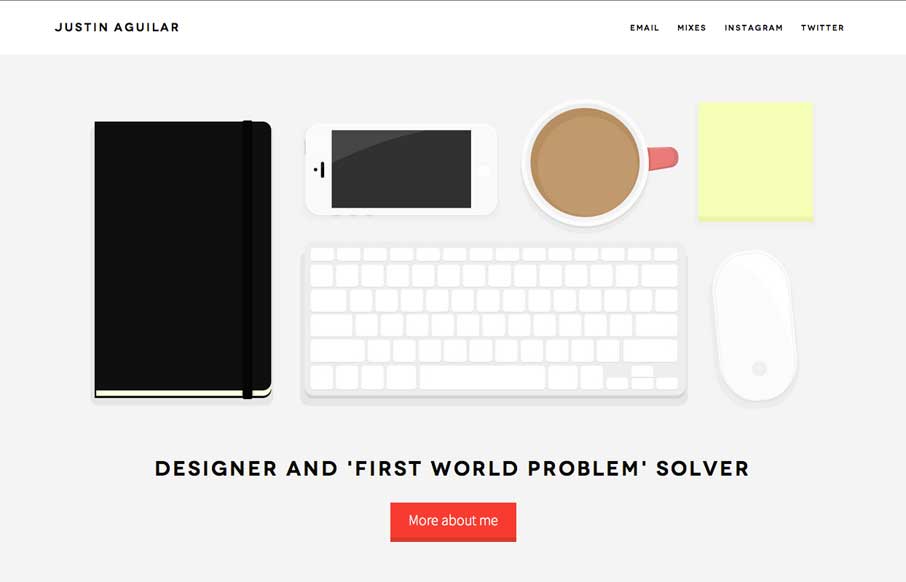
by Aaron Griswold | Aug 5, 2014 | Gallery
Really like Justin’s use of navigation, both in the Work section, and in the header. It’s different, active, animated, and gets away from the proverbial hamburger menu icon – which is always a good thing. The rest of the site is clean and crisp, with...