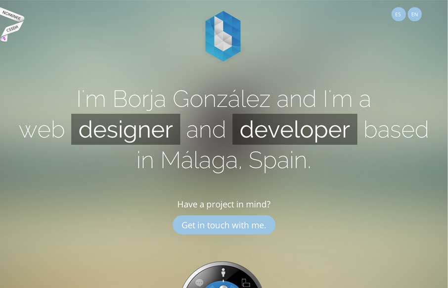
by Aaron Griswold | Aug 8, 2014 | Gallery
Borja has a cool CSS feature that you probably don’t on your portfolio site – a dial that brings up different content. Why should you care – because portfolio sites should not just be about showing your previous work, but also to: Try. New. Things....

by Aaron Griswold | Aug 8, 2014 | Gallery
The things I would have said about Konnu’s website were exactly what their founder said about it (below). Added to what he said, I like how the navigation works in the mobile version – gives it a little of the current app navigation feel. Submitted by: Tim...
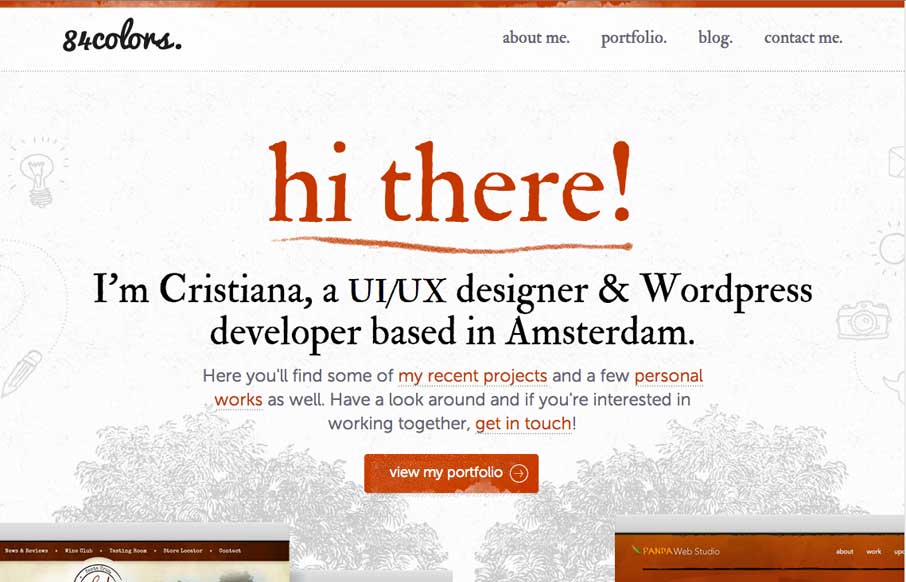
by Aaron Griswold | Aug 7, 2014 | Gallery
Christiana Bardeanu’s portfolio site shows off her work, and probably shows off a little of who she is a human too. She has her portfolio of work page which is good, but pay special attention to the floral background images – then go to her blog, and...

by Aaron Griswold | Aug 7, 2014 | Gallery
Great portfolio site that is simple, but has some sweet subtle functionality items that make it cool. And make sure you look at his resume – if Ash is this detail oriented with his resume, pretty sure he is with his work...
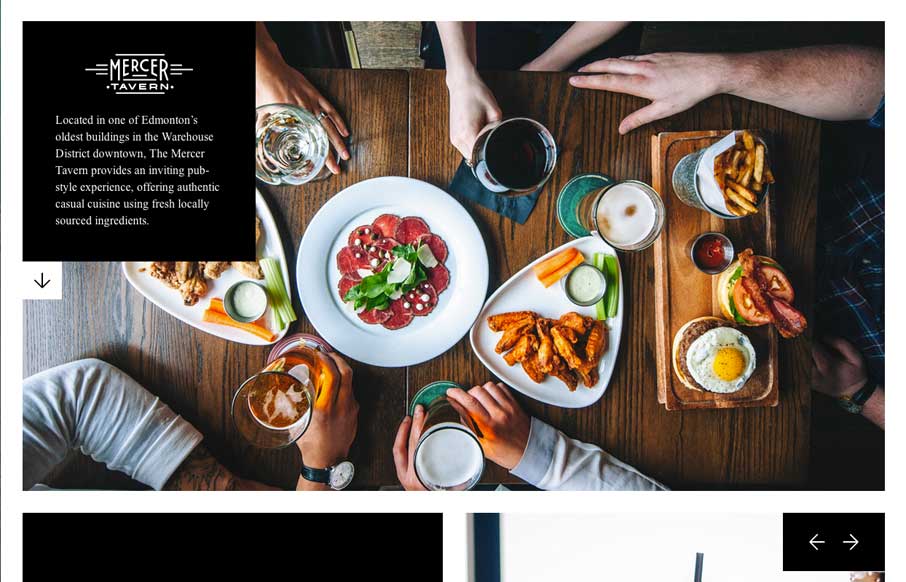
by Aaron Griswold | Aug 7, 2014 | Food and Beverage, Gallery
The majority of restaurant websites are awful. Period. Mercer Tavern’s website on the opposite side of the spectrum. They prove that you can make a great restaurant website, that is clean, cool, and small. The pictures make the site cool, and the literal white...