
by Gene Crawford | Sep 24, 2014 | Gallery, Sports/Recreation
Nice vibe to this design. I love the photography and the responsive work is pretty decent too. Nice seeing a lot of these patterns we see on other designer site’s employed successfully on client end-type websites. Submitted by: Carla Sartori @carlasartori23...
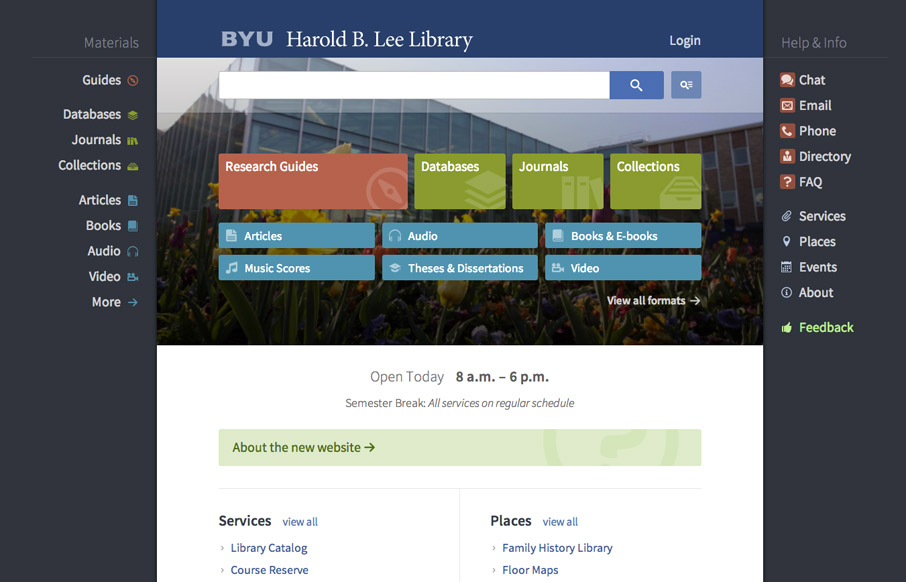
by Gene Crawford | Sep 22, 2014 | Education, Gallery
Very interesting user experience design going on. I really dig the fixed side menus a lot. Very smart interactions. Wow. Just wow. New website for @BYU Libraries: http://t.co/xxO000oA9E Soon to be the envy of all #libweb types. Nice work, @HBLL— Erin White...
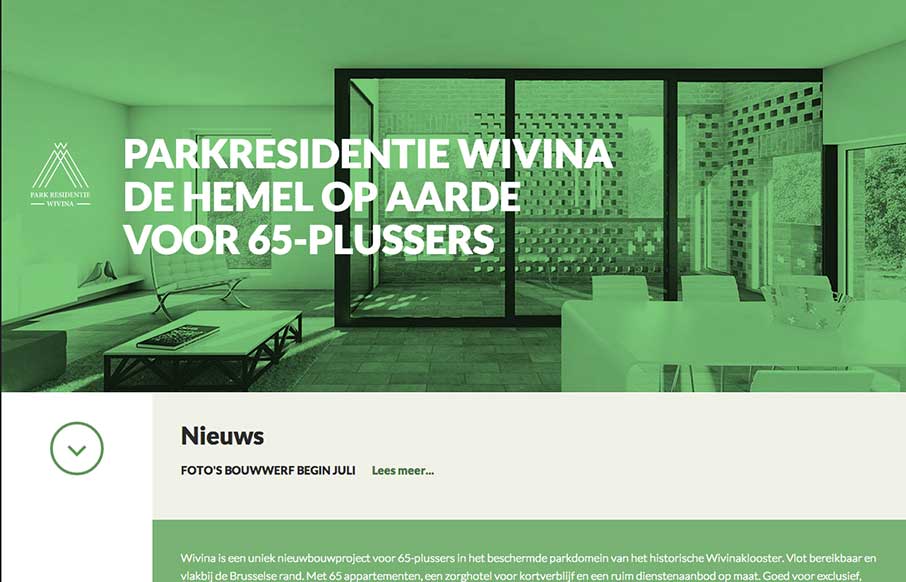
by Gene Crawford | Sep 22, 2014 | Gallery
I like how the website feels like it slides into place over the big header “hero” image area, then looks like a standard style left column nav based design. That’s a cool effect that’s really just about positioning the page elements...
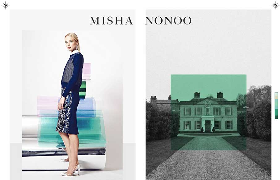
by Aaron Griswold | Sep 19, 2014 | Gallery
This is a smart and beautiful site. It packs in all the elements of a slick magazine, but on one page. I’m not usually a fan of modals, but these work because of the “static” nature of the site.
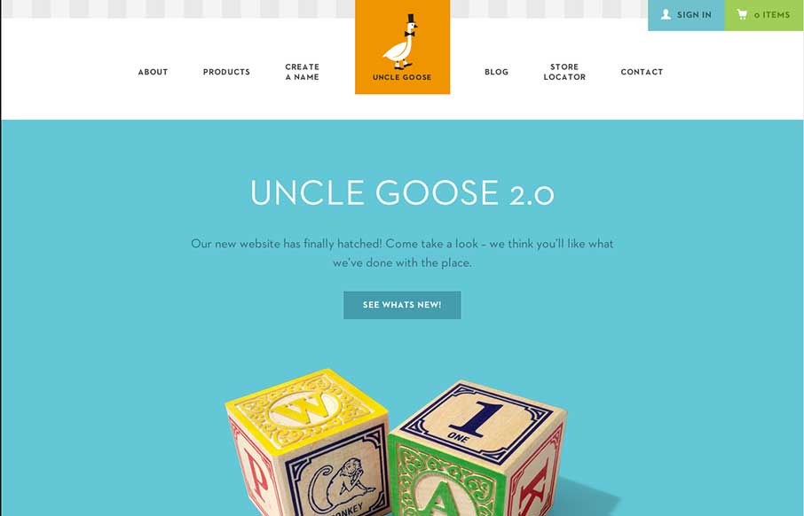
by Aaron Griswold | Sep 19, 2014 | Gallery
Old Mother Hubbard ain’t got nothin’ on Uncle Goose… I wanted to do some Andrew Dice Clay when I saw this site – but finally realized how inappropriate that might be… Now on to the site: What really sticks out is the attention to design...