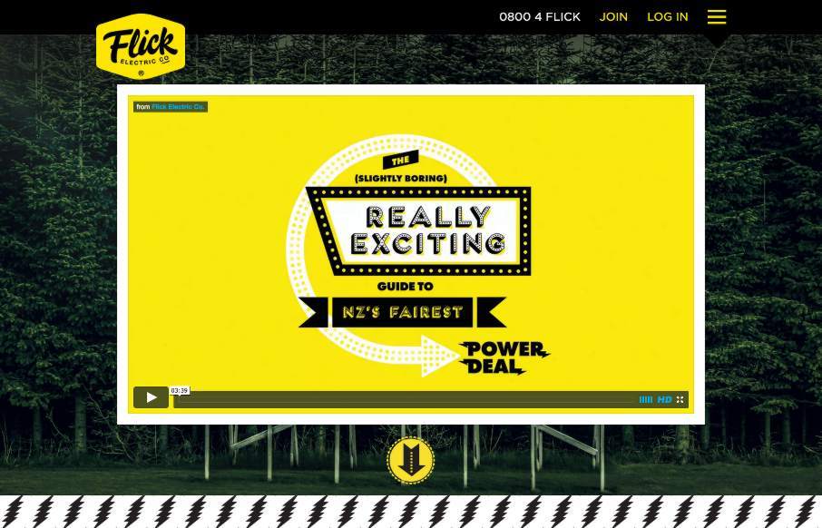
by Aaron Griswold | Apr 23, 2015 | Gallery
This Flick Electric site out of New Zealand, done by Traverse Digital in Wellington, is an example of breaking through barriers in an industry that is classically resistant to change (at least in the design sense). Flick looks to be a power / electric company that...
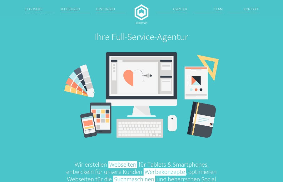
by Aaron Griswold | Apr 22, 2015 | Gallery
What I like about the pixelsmart agency site out of Germany is that they stick to a theme throughout the site – honey comb or angled view of a cube and turn it into a flat icon, you get a hexagon which shape is utilized heavily in their content design. It looks...
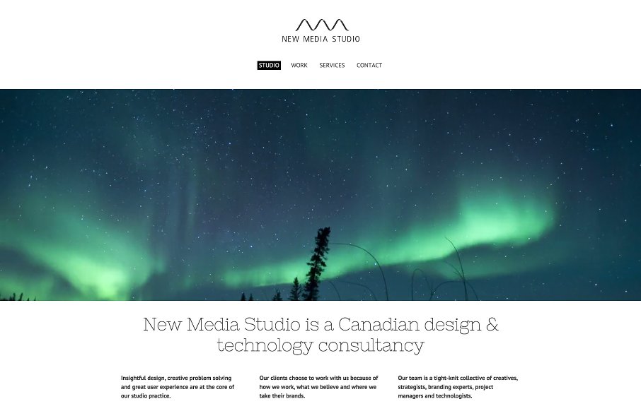
by Aaron Griswold | Apr 22, 2015 | Gallery
Love the stark white that is the canvas for New Media Studio out of Toronto – mainly because of the Northern Lights video background – cool intro. Like the filtered search on the Work page, and like that it’s not jQuery Masonry. And I think...

by Aaron Griswold | Apr 22, 2015 | Gallery, Marketing Company
Ok – turn your sound down or click it off on the top left when you get to Paquebot – but the ditty works for this agency site out of Tokyo because it fits well with the time-lapse video. And the time-lapse video makes this one-pager “sing”...

by Aaron Griswold | Apr 21, 2015 | Gallery
Love it when we get a chance to review sites a second (and third time) like Lift Interactive out of Edmonton. They’ve made another good one here. Like the mix of text treatments, b/w background images / color images / flat color illustrations. It all seems to...