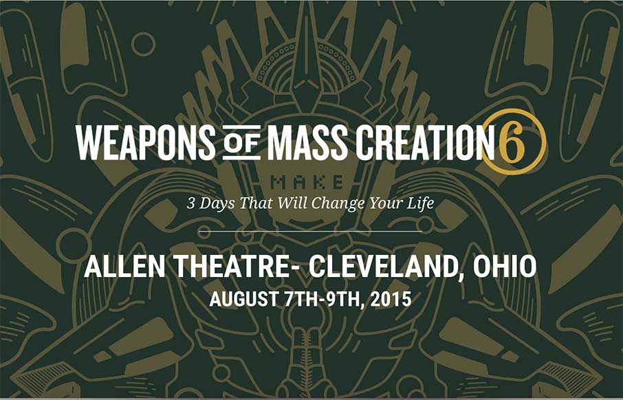
by Marcus Williamson | May 18, 2015 | Conference, Gallery
Not only is the flow funky, but the hovers are real cool and fit really well with this site by Go Media. There’s also a Save the Date at the bottom that’s real cool as well. Side Note: I love the idea of a mystery speaker. What say you...
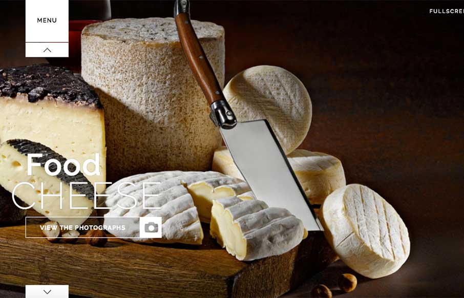
by Gene Crawford | May 18, 2015 | Fashion, Gallery, Portfolio
Great photographer portfolio site for Hermes Tochetti out of Italy. Like that the directive is to view the work, and nothing else – that’s why the “Fullscreen” button ask (top right), and the scroll arrows is smart.
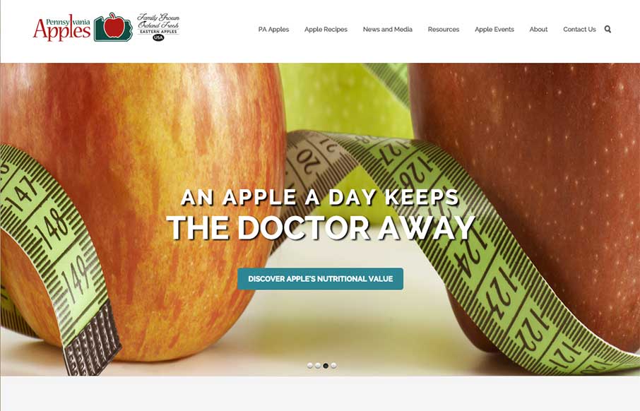
by Gene Crawford | May 14, 2015 | Food and Beverage, Gallery
Straight forward website layout for Pennsylvania Apples, but the imagery is super great. Awesome photography and it’s use can really carry a project, this site is no exception. I love the little hop the apples do as you mouse over the different types of them,...
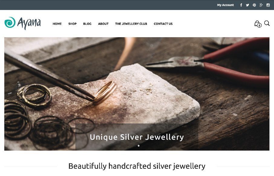
by Aaron Griswold | May 14, 2015 | Gallery, Shopping
Good looking jewelry shopping site from Ayana Jewellery, done by Loophole out of London. Clean and easy to maneuver – looks like it’s done through WooCommerce and WordPress. Like the idea and the flat illustration of/on the Jewellery club. From the...
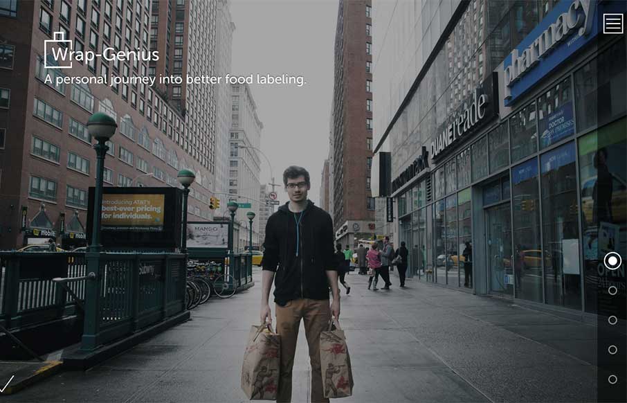
by Marcus Williamson | May 14, 2015 | Food and Beverage, Gallery
Recently I stumbled upon Sam Slover’s attempt at pushing the envelope in the food labeling department. This is a beautifully designed site that Sam created to track his food for 10 weeks. The colors and illustrations are well done and the actual flow of how he...