by Gene Crawford | Nov 5, 2015 | Gallery
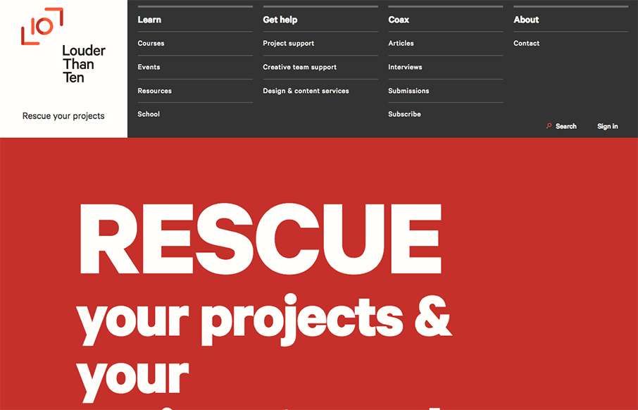
Louder than Ten, the digital home of Rachel and Travis Gertz, is a wonderfully designed approach to a digital services company website. I love the thoughtfully placed main navigation, including it’s transformation on smaller screen widths, and the large and easy...
by Aaron Griswold | Oct 19, 2015 | Entertainment, Gallery
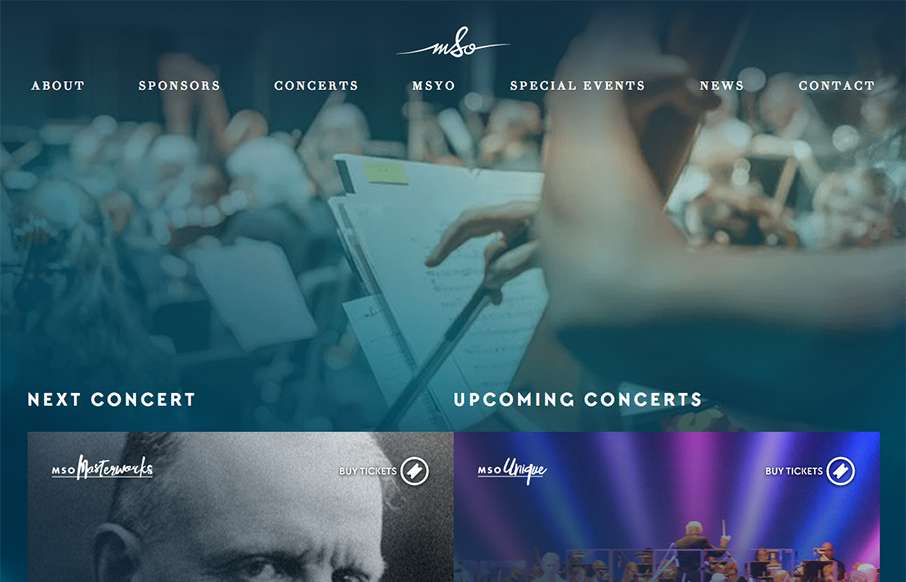
Beautiful, flowing site from Chargefield out of Ontario, for the Mississauga Symphony Orchestra. With flat / material design and other design trends, we see less “textured” type backgrounds it feels like. They’ve done a good job of having the...
by Aaron Griswold | Oct 14, 2015 | Design Firm, Gallery
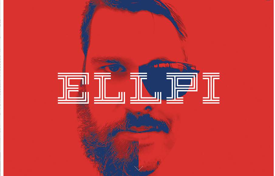
Cool looking red, blue and white agency site out of Montreal from Ellpi. It’s very simple and clean, with good white (red) space. I like how the video backgrounds on the site are not featured, they are more like footers on interior pages. From the Designer:...
by Gene Crawford | Sep 30, 2015 | Gallery
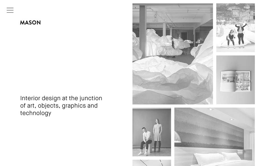
Really cool minimal approach to the interior design studio Mason’s website. I dig that you basically only check out some images then there’s the hamburger menu, because they take you to some good sample pages of the company’s work. Simple flow of...

by Gene Crawford | Sep 21, 2015 | Gallery
Nice use of images and supporting graphical elements. The flowers and website element colors match up with the photography really well, that’s not easy to get done. I like the way it scrolls rhythm wise as well as slight parallax scroll on the header...