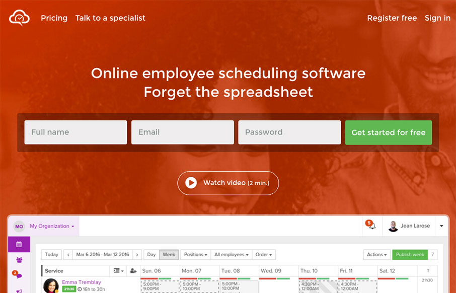
by Gene Crawford | Apr 18, 2016 | Gallery
Well done product website for Agendrix. I dig the way the signup form has been designed the most about this site. The fields are lined up horizontally, giving it a sense of ease or speed to start the signup process. It also has the label “Get started for...
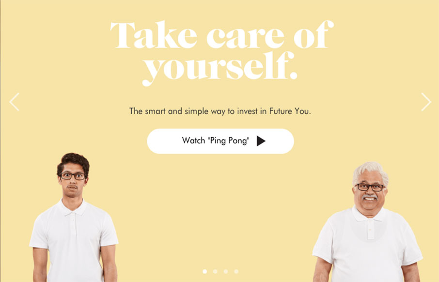
by Gene Crawford | Apr 6, 2016 | Gallery
Wealthsimple doesn’t look like any other financial website i’ve seen before. Ditching the status quo corporate colors for a softer more non-traditional vibe they really get it right. Playing up the personalization feel to the tee. I love the typography on...
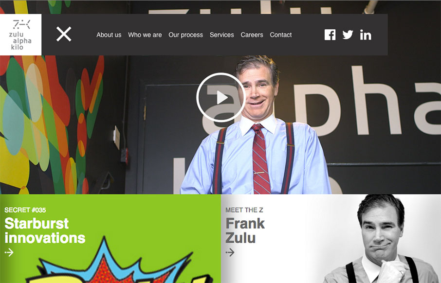
by Gene Crawford | Mar 17, 2016 | Design Firm, Gallery
Yeah it’s a parody agency site, but it’s actually not that bad of a design. Fun stuff, but it works pretty well.
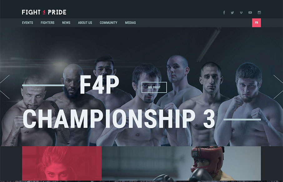
by Aaron Griswold | Mar 16, 2016 | Gallery
Great looking site for Fight 4 Pride out of Quebec, created by Phoenix. Excellent coloring and font work. Really like the Fighters landing and detail pages too – laid out very well.
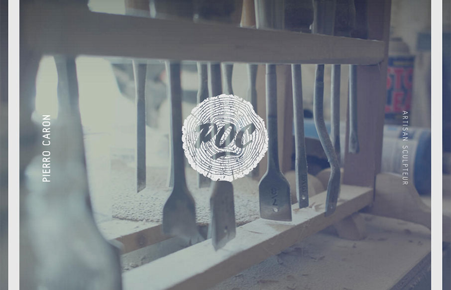
by Gene Crawford | Mar 8, 2016 | Gallery
I LOVE the vibe of this site design for POC Sculpture. It feels soft and wispy with strong lines and edges. Kinda like sculpture 🙂 There are some really nice little interaction details here as well, like the slight movement as you scroll and then check the “back...