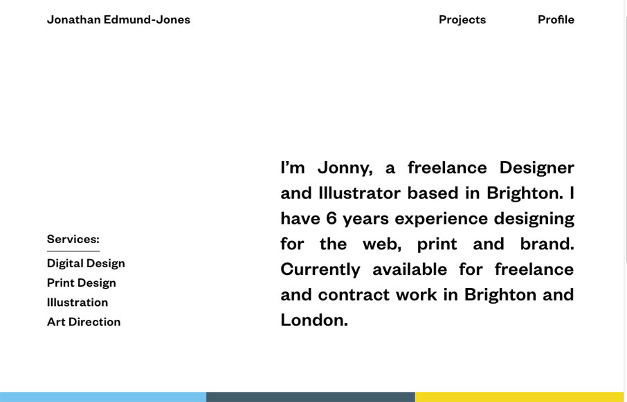
by Gene Crawford | Apr 21, 2016 | Gallery
Pretty nifty and very different looking/feeling site design for Jonathan Edmund-Jones. I like the way the top half is black and white and all text with the second half mostly color and work samples. It’s a nice reveal as you scroll down, creating a pretty nifty...
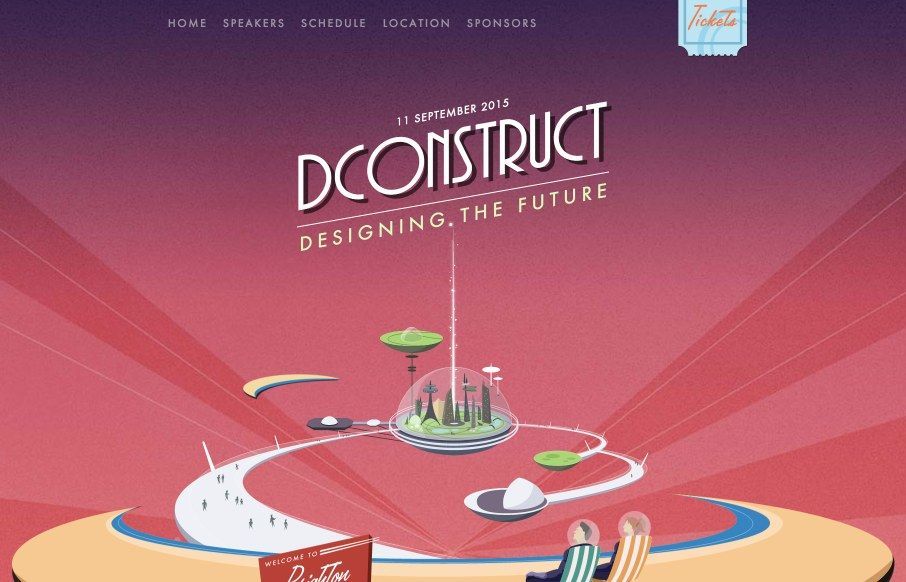
by Gene Crawford | Jun 29, 2015 | Gallery
There is a lot to love about the 2015 dConstruct site. Clearleft always does something cool with this site every year, I always enjoy it when they launch it. I really like how it doesn’t take itself too seriously with the layout (mobile vs. desktop). It’s...
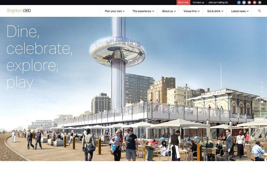
by Aaron Griswold | Jun 11, 2015 | Gallery, Travel
Starting to really enjoy things and sites coming out of Brighton, like this one for Brighton i360. Good grid-centric design – clean and simple. Looking forward to it being built and visiting.. next time I’m in the UK. @TheBrightoni360 made...
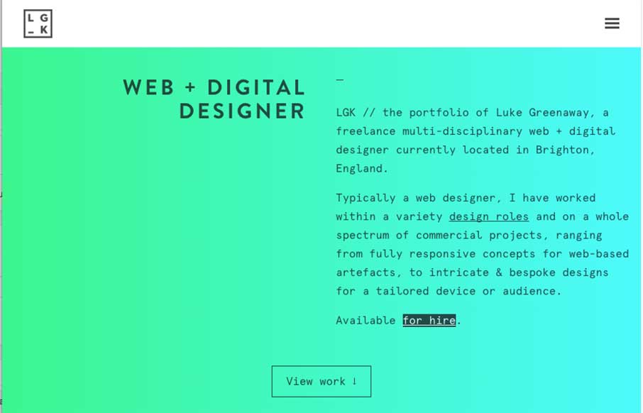
by Aaron Griswold | Feb 25, 2015 | Gallery, Portfolio
Really like this portfolio site from Luke Greenway out of Brighton, UK. It’s smooth and classy? – can’t find better words for to describe that right now. Also starting to like this trend of sticky headers that reveal in a different color when you...