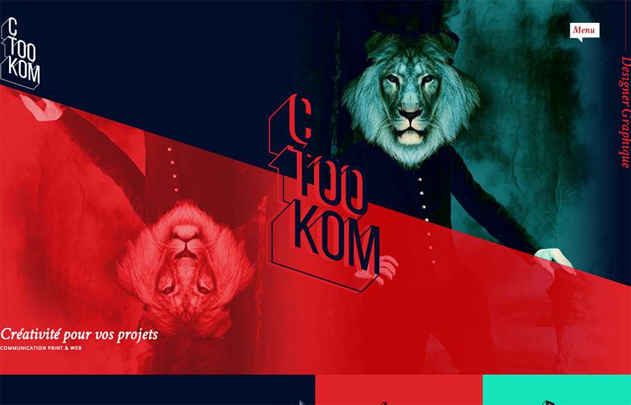
by Gene Crawford | Jul 29, 2015 | Gallery
Man, this site blows me away visually. I love that logo/display type and the colors, man. I love the header and how it slides away from being a large hero area and keeps itself there in the fixed header, but still has that slight parallax slide vibe. Strong stuff....
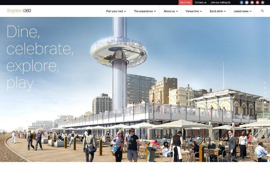
by Aaron Griswold | Jun 11, 2015 | Gallery, Travel
Starting to really enjoy things and sites coming out of Brighton, like this one for Brighton i360. Good grid-centric design – clean and simple. Looking forward to it being built and visiting.. next time I’m in the UK. @TheBrightoni360 made...
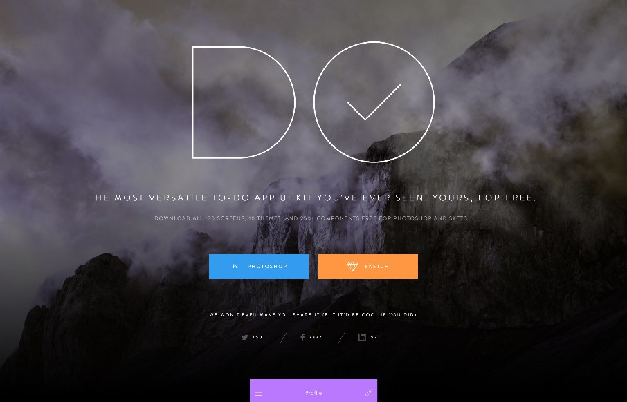
by Aaron Griswold | Jun 11, 2015 | Gallery
Cool landing page from InVision with their new To-Do App UI Kit. Love the intro – the CSS animation of the cloud .png overlaid on the mountain .jpg makes it look like the mountain and clouds are a video background. Looks like they share every single possible...
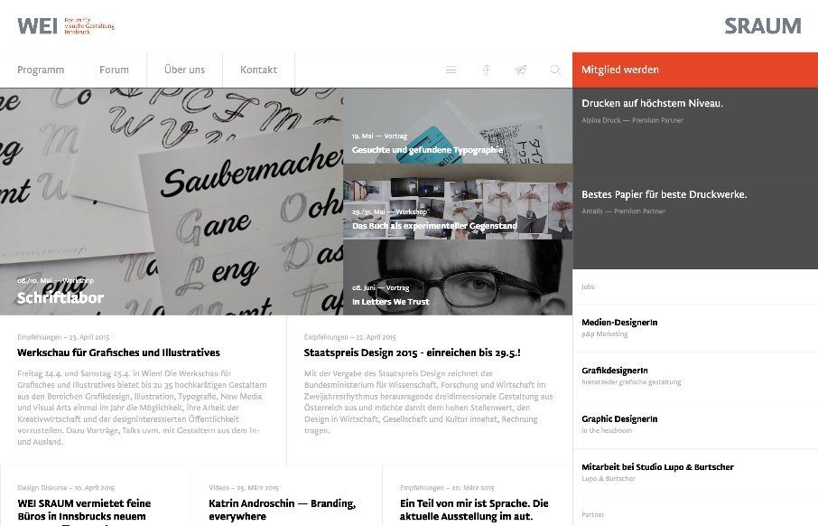
by Gene Crawford | Jun 4, 2015 | Conference, Gallery, Nonprofit
There is a lot going on here to get this website responsive visually. The grid is pretty core to its layout and it flows really well from screen to screen width. I also really dig how the header/nav stays fixed and moves up visually as you scroll down. From the...
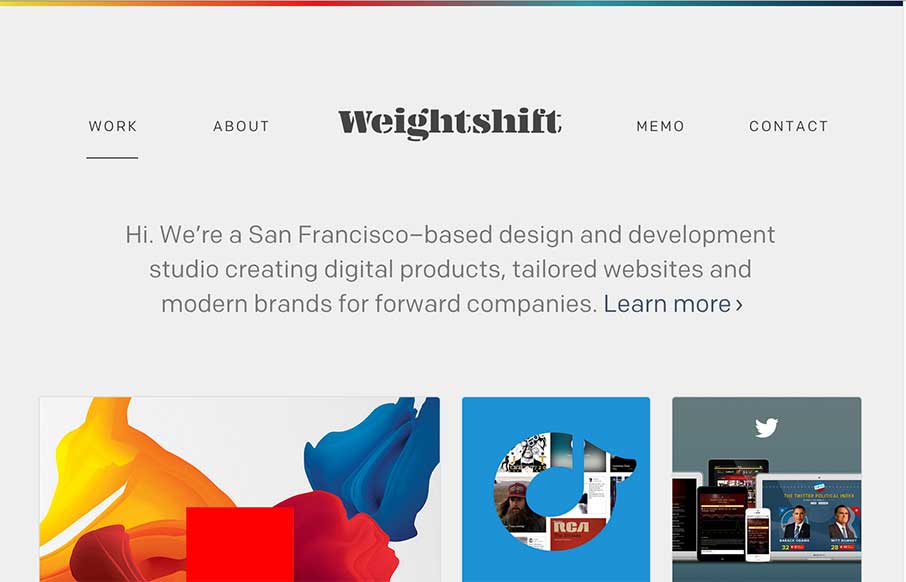
by Gene Crawford | May 20, 2015 | Gallery
Every now and then Weightshift will rework their website. I’m in love with this version for sure – not that the past dozen were not good by any stretch. I love simplicity and the way this site has traveled down that path over the years is a work of art....